
Visuals: How to create visuals for blog posts [2023 Colossal Guide]
Visuals can be broken down into the elements it has. A blog post image will have visual and text based elements, depending on its purpose.
And they are much needed to provide a good user experience. This article will cover blog post visual design, in depth. Keep reading.
Guide to blog post visuals
- Determing the size of the image
- Having your logo within images
- The 3 blog post image types
- Placing text within an image
- Visual data: What Google loves most
- Infographics: A visual representation of a blog post
- Screenshots. The best choice for blog post images
- Photos: Real life images that hit different
- A blog post’s featured image
- Understanding how images make a difference in user experience
- Are images important for blog SEO
- How long does it take to create an original graphic
- The informality of animations, memes, and gifs
- How often should I use images in a blog post
- Blog post images can be reused
Determining the size of the visual
Before making any visual, determine the blog post width of your blog. The blog post width is explained in the picture below.
Any image you make will have this width. The same as your content width.

Next, you need to consider the height of your image.
This will depend on what you’re displaying within it. It can be short, or long [Like an infographic].
Having your logo within the visual
It’s always a good idea to place your logo within the image. Especially for images that have the potential to be reused by others online.
- The logo can be placed within the corners of the visual [You’ll see the logo in the left bottom corner in most graphics, but it can be placed in any corner].
- It can also be placed on the sides [Top, bottom, left, and right side]. This can depend on your branding or on a per visual basis.
If logo placement in the image depends on your branding, it means you’ll place your logo in that location for all images [Which makes it easy for users to recognize the visual belongs to you].
Or, you can place the logo in different places.
- The logo can also be placed within the background of the visual, or as an overlay over the background.
This is otherwise known as a watermark. Watermarks are great to prevent people from using your content without your permission or without crediting you.
The 3 blog post visual types
The visual falls under one of 3 types:
NO text visuals
A NO text visual is where there is no written copy [Not even numbers] within. Which means it’s purely visual content. The following are examples of NO text images.
- Real life photos
- Stock images
- Illustrations
- Graphics
Real life photos and stock photos are usually used on their own as NO text visuals to be placed within blog posts as content breaks.
Illustrations and graphics are used as elements that can be added on their own to blog posts.
Or they become part of [Used in conjunction with] the other 2 types of images: Single phrase and text images
“Title only” or “single phrase” visuals
A “title only” or ”single phrase” visual contains visuals elements along with a single phrase [A single piece of text].
A common example is the featured image of a blog post. A featured image is used to represent the blog post to attract traffic using visual methods [More on featured images later].
Such images are usually used to introduce a blog post or subtopics within the blog post.
Text visuals
A text visual is a combination of text and visual elements. And infographics are considered text visuals.
Where you explain pieces of text using graphics and visual data. As mentioned before, graphics become part of infographics quite frequently [More on infographics later].
A text visual is commonly used for in depth visual explanations to ease user understanding of complex topics.
Or to provide an explanation visually to surpass your competition in the search results.
Depending on what you’re trying to achieve, you’ll have to use all three types of images to improve your blog post.
Placing text within a visual
Let’s go over how you can place text within a visual and what you should consider.
Google cannot read text inside visuals
Any text within an image is not readable by Google. So, rewrite it before or after the image in the blog post.
Or add the text within the alt text of the image. Alt text is how you can rank any of your blog post images on Google images.
Alt text of visuals
The alt text of a visual simply tells Google what your image is. Because Google can only interpret text, but can’t interpret an image.
So, alt text is essentially translating an image into text.
Software to help place text within visuals
[This is assuming you already have a visual, and now you want to put text on top of it]. The best software [It is free] is Canva.
It allows you to drag and drop text boxes, write in your text, and download the image. And then, you can simply place it in the blog post.
But, if you’re looking to integrate the text within the image, you’ll need Inkscape.
Integrating the text within the image means you create the visual and text elements together, instead of placing text on top of the image [Like an overlay].
Essentially, you will need graphic design software to have full control over creating the image.
So, download Inkscape [It’s free].
How much text should I place within a visual [Based on analysis]
To understand how much text you should place within a visual, consider what the purpose of a visual is? A text visual has two purposes.
Purpose 1. To provide a break between long posts of text.
Purpose 2. To provide a visual understanding of the certain text.
For both purposes to be successful, there have to be enough visual elements in the image.
At least 50% of the image needs visual elements. Whereas, there still has to be text. And too little text will turn a text visual into a single phrase visual.
So, at least 20% of the image needs text.
Therefore, 20 – 50% of the image’s area should have text.
The text you place within the image can either be clumped together or divided throughout the image.
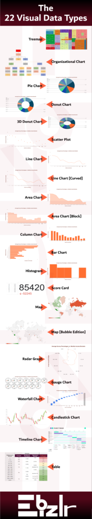
Visual data: What Google loves most
Google has always spoken of original content as being one of the easiest ways to rank high quickly.
This includes adding experimental data you can gather through surveys, tests, and case studies.
You can even convert the data into an image form, otherwise known as visual data. Here is a list of visual data types.
These 22 visual data types can convert a table of raw data into a colourful visual which will provide users with a better understanding of the data.
| Line Chart | Area Chart | Column Chart | Bar Chart |
| Pie Chart | Scatter Plot | Map | Waterfall Chart |
| Histogram | Radar Graph | Gauge Chart | Scorecard |
| Candlestick Chart | Organizational Chart | Treemap | Timeline Chart |
| Table Chart |
Infographics: A visual representation of a blog post
Infographics are text visuals that vary in length depending on whether it explains an entire blog post or just part of it.
They require the most time and effort compared to any other graphic. The infographic I created above took 3.5 hours to create.
But, are infographics worth it? Yes. Infographics are one of the most shared pieces of content.
Other blogs end up using your infographics and link back to you [Which means free backlinks].
Plus, it’s a strong visual addition to your average blog post, which spikes user experience.
Even your visitors realize from your infographic that you put in a serious effort.
But, when is it a good idea to build an infographic? Only if you have 3 – 4 spare hours to build one.
What do infographic visuals include?
Infographics include the following:
- A header title: The title explains what the infographic is about. It should be a large piece of text at the top of the graphic
- Info and visual sections: An infographic can end up being quite long, and cluttered. Which is why it’s a good idea to break it down into sections. There should be sections where you write text content. As well as sections for visual content.
- A strong border: Because an infographic can get quite cluttered, you want to have a bold margin. And have everything within the margins/ borders.
- A footer logo: You should end the infographic with a footer section where you display your logo.
- Watermark: A watermark should be added to your infographic. But add it in a manner where it looks like a background design.
Make it look like a backsplash. This will avoid someone from using it without crediting you.
Even if they don’t credit you, the graphic will have your watermark.
When’s a good idea to build an infographic?
You can build an infographic for any sort of list. So, an infographic can be built from all list based posts, as well as lists within posts.
Illustration visuals
Illustrations are visual conversions of text to better help in understanding a written piece of content.
And, illustrations are mostly used as part of infographics.
Infographics: Gifs + Infographics
Gifographics are simply infographics with gifs or moving components. It’d be a far better idea to create a gifographic instead of an infographic.
Simply, because adding in moving components won’t take that much time, but it will result in a much better infographic.
Which will also increase its shareability.
Screenshots. The best choice for blog post visuals
Screenshots are extremely easy to make and place. Just take a screenshot of something online, and paste it into your blog post.
Screenshots are great for tutorials or list based blog posts, where you’re showing some sort of online processes or elements.
For example, if you talk about how to start a WordPress account, you can provide screenshots of the user interface so the users know exactly what you’re saying.
Because of this, they’re also considered one of the most helpful pieces of visual content a blog post can have.
Annotated Screenshots
Annotated screenshots are when you take a screenshot and edit it with annotations that include drawing lines and shapes to better explain yourself through the screenshot.
It’s extra work, but it shows that you put in a lot more effort. And it’s still much less work than creating infographics.
Photos – Real life visuals that hit different
Photos are great to bring a real life touch to a blog post. The best outcome would be if you took your own photos.
Or you could just buy stock photos online. Such photos don’t add much value to the blog post unless they show the text content of your post in an image format.
If they’re just used as filler images, they won’t be helpful in terms of SEO.
Filler images are just there to break up content and let users see something other than text, which may not be directly relevant.
Are stock photos way too overused?
Yes, almost all blog posts have stock photos. You’ll realize blogs have the same stock photos once you go through enough blog posts.
Especially the royalty free stock photos. And, because of that, the users are well aware of stock photos. But, it doesn’t affect user experience.
Though, using self made graphics [Infographics, annotated screenshots], provide a much better and more helpful experience.
A blog post’s featured image
The featured image is a visual that represents the blog post.
A good featured image will have the blog post title or part of the title along with some visual display.
The image can be a graphic or a background photo.
Not only do featured images act as visual representatives for blog posts but for social media and Youtube, as well.
But if you reuse the featured image for youtube, the image would work better if you have your own portrait within the image.
Because the best thumbnails on Youtube have the faces of their creators.
Understand how visuals make a difference in user experience
Visuals are far better to look at, instead of text. But, people still want to read text [Or at least skim through it].
But, going through a long blog of text, with no breaks in between can get quite irritating. Irritation leads to people clicking off your site.
So, all a piece of text needs is image breaks. As mentioned above there are several graphics/ images you can place within a blog post.
Some are better options overall, and some are more difficult to create. But, any sort of visual still helps break text content, and thus, solves the problem.
Therefore, having images is a must in providing a great user experience.
Are visuals important for blog SEO
Visuals aren’t as helpful for SEO. This is the case when compared to text content. Google’s search algorithm is primarily designed to make sense of the text, not images.
This is why alt text was created [Which converts an image to text]. However, the concept of SEO is to provide content that Google is willing to rank.
And Google’s main ranking factor is to provide its users with a good experience. And images, as mentioned throughout this article, provide a better user experience.
So, blog post visuals are important for SEO indirectly, and will help you rank better in the long term.
How long does it take to create an original visual? Not that long.
Original graphics can take up to 4 – 5 hours depending on the length of the graphic.
However, if you create a template for your graphics to follow, it takes far less time.
For example, you can create a template for your featured images, as you require them for all your current and future blog posts.
But, what is a template consist of for a graphic? Suppose we create a template for a featured image.
It will require your logo, your blog post title, a background, potentially a background overlay, and graphics.
As well, the featured image will have fixed dimensions that won’t change with each blog post.
Therefore, your template will have a fixed length and width.
It will also have the logo placed in a certain spot [Which can remain there for all blog post images].
For the background, you can either have a fixed background for all your blog posts or change it.
Regardless, changing the background shouldn’t take long unless the background is a visual graphic you create.
The title will also be of the same font and size, so all you need to do is write the title. And, lastly, you can add a graphic.
The graphic can be created by you [Which can take 1 – 1.5 hours]. Or, you can get an illustration online.
Several platforms provide free illustrations for you to choose from [Like FreePik].
Following a process like this for your images can make you efficient and reduce the time you spend per image without losing quality.
Without a process, it can take 4 – 5 hours. But, with a process, it can take less than 1 – 2 hours.
The informality of animations, memes, and gifs
Many blog posts use animations, memes, and gifs. And they’re a fun element to lighten up a piece of content.
However, they are not the best choice for all blog posts. They can do well depending on your writing style.
If you have a more serious writing style, then they wouldn’t make sense.
Whereas, if you have a goofy writing style, they’d be perfect.
So, you must personally assess yourself to figure out whether animations, memes, and gifs would suit your blog post.
At the end of the day, you can choose to use them regardless, because it is your blog, and it won’t be negating user experience in any way.
Just don’t overdo it. We all know that one guy who keeps joking around to the point where it’s annoying.
How often should I use visuals in a blog post?
There should be at least 1 – 2 images per 1000 words and no more than 1 image per 250 words.
Having too many visuals will break up the content excessively and make it hard for users to follow along.
And having too few will turn a blog post into a boring long piece of text.
Blog post visuals can be reused
Visuals can be reused in your social media, as well as other blog posts.
And, a single visual can be used several times as long as there’s enough buffer time between reusing it.
This is otherwise known as content repurposing and redistribution.