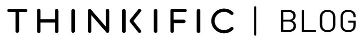
Blog logo: How to design a logo for your blog
The blog logo is your business’s identity. It represents your blog. So, it only makes sense to take the time and learn how to design a logo for your blog.

Blog logo design guide
In this article, we’ll cover how to design a blog logo [step by step], and provide you with 37 examples of logos to take inspiration from when making your own. Keep reading.
How to add a logo to the WordPress header?
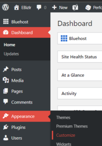
Here is a step by step procedure for how to add a logo to the WordPress header
- Go to the WordPress dashboard
Go to the WordPress dashboard > Appearance > Customize

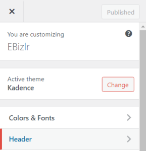
- In WP customize, click the header
If don’t have a header set up on WordPress, check out our blog header design guide.

- Add the logo to the header
From the available items, drag and drop the logo to one of the header rows [Your preference], & then hit publish.
In the screenshot below, the logo is dragged and dropped to the main row of the header.

To add a logo to the WP footer, go to the WordPress dashboard > Appearance > Customize > Footer > From the available items, drag and drop the logo to one of the header rows [Your preference], & then hit publish.
If you don’t have a footer set up, check out our blog footer design guide.
To change the logo in the WP header, go to the WP dashboard > Appearance > Customize > Header > The logo tab [One of the drag and drop items] should be in the header.
Click on the small gear icon inside the logo tab. That will open up the logo customization features. Or click on the tab itself. And then, click on Change Logo and change it to whatever you’d like.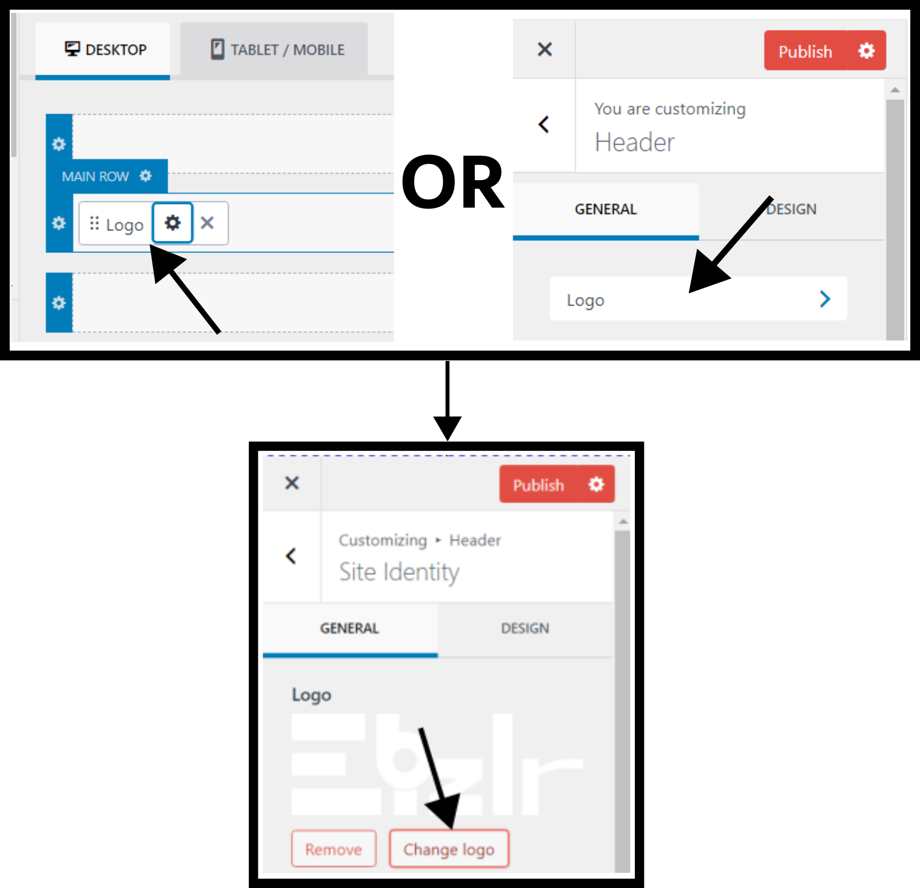
To change the logo size in WordPress: Go to the WP dashboard > Appearance > Customize > Header > Click the logo tab [Or the gear icon] > And change the Logo Max Width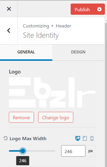
To add a favicon in WordPress:
Go to your WP dashboard > Appearance > Customize > Site Identity
Then simply click on the Select site icon and upload the graphic file you want your favicon to be, and hit Publish. 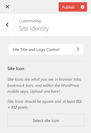
Note: Your favicon graphic should generally be your logo or part of your logo.
How to design a blog logo
This section will cover 2 processes of designing a blog logo:
- 6 design questions you must answer
- Logo research
5 Blog logo design questions
Before building a logo, you need to have a context or a story to build the logo on.
Here are 5 questions to answer before designing your logo:
What is the name of your blog business?
The importance of this question is that most blogs implement their name within the blog. You might too.
You may already be thinking of logo ideas with your blog name in them.
For example, see the blog logo below. It’s simply the name of the blog, “Perez Hilton”.

What is the purpose of your blog business?
The importance of this question is that a logo’s element or style could be built based on the concept of the business purpose.
For example, take the blog logo below. The purpose of this blog is to “provide recipes that are made using plants”.
And they clearly have their purpose reinforced [with a bunch of “vegetable graphics” right beside their blog name].

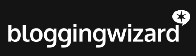
What should your blog logo display?
The blog logo is made to display your blog’s identity. It’s should be filled with elements you want your users to remember your blog by.
But what should you have in your logo to display your blog’s identity? Let’s take a look at a few examples:
Blog logo example 1
In this logo, “vegetables” and the blog name itself are displayed.
Making the blog name a part of the logo is a great way to ensure people will start remembering it.
The “vegetables” graphic gives intel to people on what the blog will be about. Which, in this case, would be about “vegetable recipes”.
So, this logo included the blog name and a graphic representing the blog niche which does a great job of displaying the blog’s identity.
[Learn more about niches and how to select a profitable one from our blog niche guide]
Blog logo example 2

In this logo, the following elements are displayed:
- The blog name
- A graphic
- A tagline
Again, the blog name is used in the logo so it’s frequently displayed in front of the user’s eye [So they memorize the name].
A graphic is also used, and displays a “J & L” [The initials of “Jon Loomer“], to make the logo interesting. Here, the graphic isn’t used to display what the blog is about [Like in example 1]
And, a tagline is added as well to inform users what the blog is about [To avoid any confusion].
Since it’s in the logo, people will always know immediately what the blog is about independent of what page they land on [Initially].
Because users don’t always land on the home page, they can land on any random page [From the search results].
Blog logo example 3

In this logo, the following elements are added:
- The blog name
- A graphic
- Background graphics
It’s pretty common for blogs to display their name in the logo, simply because blogs aren’t popular like high brands.
For example, you won’t remember a blog the same way you’ll remember “Nike“. So, it’d be a good idea for your blog to also display its name in the logo.
A graphic of a quill is also added to represent some sort of writing. In this case, it’s referring to the diary/ blog itself.
And, background graphics are also used [The ribbon strip and circle] to make the logo more attractive to the eyes.
Example 4. The UnderArmour logo

When you see their logo, It’s a graphic that displays the initials of the business name [A “U & A“].
Here, the name isn’t a part of the logo. Because, this isn’t a blog, but rather, a huge business.
So, its branding works differently, and this business doesn’t need to display its name in the logo since users already learn their name through other means.
What is the blog’s personality?
This question is important as the personality of the blog should be represented within the logo. If you have an easygoing and chill blog, your logo should match that personality.
If you have a serious blog, vice versa. For example, easygoing, relaxing or fun can be represented with wiggly lines.
Where seriousness can be represented with straight lines and sharp corners. The personality can also be created with colours and graphics.
It’s not just the personality of the blog, but it can also be the personality of the blog name itself.
Example 1
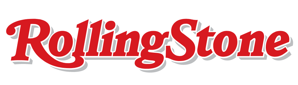
The blog name has the word rolling. And the font they used looks like it’s rolling. Especially the letter R.
So the design of the logo matches their blog name “rolling“
Example 2

The logo above is supposed to be talking about an important topic [Which is “Men’s health“]. So, this topic is serious.
As mentioned earlier, anything serious can be represented with straight lines and sharp corners. Which is exactly what the Men’sHealth blog logo has done.
Their logo is purely their blog name written with a sharp, straight, and bold font representing that seriousness.
Where will you place the blog logo?
This is an important question because how a logo looks depends greatly on its environment. A logo is usually placed in the following places:
- The blog header
- The blog footer
- In any blog visuals or graphics created [Learn about the easiest visuals] to create in minutes for your blog]
- In marketing campaigns
- In social media [Social media is just ONE of the 9 methods to improve blog post traffic]
So when coming up with ideas for your logo, you need to consider how the logo will fit in these different environments.
Place the logo in the blog header
The blog header is a bar at the top of a blog. And this bar is spacious horizontally and congested vertically.
So logos that are vertically long will have to be minimized [Which means the logo will be really small].
Whereas horizontally logos will look great as they’ll fit right in.
Now, the header can be increased in size vertically to adjust any vertically long blog logos, but that’s something you should keep in mind.
Learn more from our blog header design guide.
Place the logo in the blog footer
The blog footer is a spacious region, so mostly any blog logo size will fit in fine.
Now, you’ll realize that the colours of the logo weren’t mentioned since the header and footer colours could be created in contrast with the logo colours [It’s something you can control].
But it’s not the case with the rest. Take the logo below as an example, the background colours used for the header and footer were chosen while ensuring they contrast the logo nicely.

Learn more from our blog footer design guide.
Place the logo in the blog visuals & graphics
When placing it in visuals and graphics, the colours surrounding the logo will differ from visual to visual.
So, consider either having your blog logo shown with different colours or having an overlay placed in between the visual and logo to make sure the logo can be seen.
As well, depending on the visual, your logo will end up covering a part of it.
So, you need to also think of where you’ll end up placing your logo [depending on its length, width, or radius].
For example, see the following logo.

And here is an infographic they created [With their logo in it]

Here are steps they took for making sure their logo displayed well.
- They changed their logo colour to white
- They added a black overlay between the actual graphic and logo to ensure it stood out.
- Since this logo is a horizontally long logo, there wasn’t much trouble with placement.
In response to point 3 above, if it were a vertically long logo, you could simply increase the height of the overall graphic.
Learn more from our guide on blog post visuals.
But I’m sure you realize, horizontally long logos do tend to work better in most environments without having to modify their environment too much.
Once you’ve answered the 6 questions above, you should already be having several ideas in your mind.
But we’ll take your idea generation to the next level with phase 2, logo research.
Blog logo research
This phase is where you start looking at logos already out there and find ones that you can take inspiration from [You’ll be good at logo research if you’re good with keyword research].
Keep in mind, you’ll find certain logos much cooler than others from your POV.
But know that your logo must be good for your audience [And therefore, it should be built on the 6 pillar questions mentioned above].
This phase is simply to get more ideas and concepts rolling in your head.
Note: Only look at the logos of blogs [Since you’re building a logo for a blog]. The following guidance is to research logos of blogs [NOT other types of websites].
Competitor blog logos
Your logo might end up being similar to your competition since you’re focusing on a similar niche and keywords.
And, so, check out all your competition and see the types of logos they’ve built.
This will give you an idea of the type of logos they’re working with, as well as how much effort they’ve put in. To learn more from your competitors, see our guide on performing a blog competitor analysis.
Logos of top performing blogs
Logos of top performing blogs should be looked at for several reasons including the following:
- They’re top performing blogs, and so they know what they’re doing [Which also applies to their logo].
Which means their logo worked well for their niche. Check their logo for:
- Their blog name [And initials]
- Graphics [And how their graphic relates to their blog or blog name]
- Colours
- Font type, style, and colour
Top performing blogs are usually in the industry for a long time
Meaning they’ve most likely gone through a lot of logo design testing before they resulted in their current logo.
This means their current logo is the best performing one.
Logos of the richest blogs
The richest blogs are the ones that converted the best. This means these blogs do their best at making their entire site great at conversion.
Including their logo. So, looking at their logo will also give you good ideas.
Related. Find out how much money the richest blogs make.
Logos of blogs in different niches
Just looking at the competition for blogs won’t be enough. And it’ll make you narrow minded when creating your logo.
So, check out blog logos from different niches, and see how the average blog logo differs from niche to niche.
Learn more grom our guide on blog niches.
Research the 6 pillars of a blog logo
You should also research the 6 pillars of blog logos that include the following:
Shapes
A blog logo can have any sort of shape. So, you should consider all types of shapes [Like the few in the picture below]

Not just geometric shapes, but you can even create random shapes, mix different shapes, etc.
The point is to play around and see what will look good for your blog logo.
These shapes can be within your blog name, logo surrounding or just part of a separate graphic in your logo.
Colours
Researching how colours will look on a logo is crucial. More importantly, testing is required.
It’s a good idea to create several prototypes of your logo where you test out different colours, colour patterns, different amounts of colour, etc.
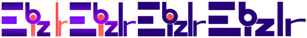
Take EBizlr’s logo for example. We created several prototypes with different colour patterns before going with a single colored logo [And a few design variations].
These 4 just show a few of the changes made. Notice how much of a difference colours can make in a logo.
Use Paletton to see how different colours look together.
Paletton is a FREE colour palette tool that provides you with colour cards and colour wheels to compare how colours go together.
The colour wheel lets you change colours with live previews on the side, which is pretty helpful to find great colour combinations via trial and error.
Read this guide on Paletton to make full use of it.
Design style
The design style represents the feeling the logo gives off to the eyes. A logo with sharp bold fonts and high contrast colours will give off a bold and serious style [Like the logo below]:
Whereas a logo with loose, flowy fonts and low contrast colours will give off a calm and soothing style [Like the logo below]:
Typeface and font
Typefaces are different writing styles. Fonts are a set of different yet similar writing styles for a single typeface.
For example, Sans serif is a typeface. And Sans serif BOLD is a font. Trial and error with different typefaces and fonts until you’re satisfied with one.
Surrounding
The surrounding as mentioned before makes a great difference in how the logo looks.
So start making a list of the different surroundings you’d want your blog logo to have.
Do you just want it to be plain white surroundings? A dark surrounding? A surrounding with a graphic or some cool design? Make a list.
Blog Logo Design Tools
This section will cover the different methods and resources you can use to build a blog logo:
Best graphics software for logos
Inkscape is the best graphics software to use for building a logo.
It’s a FREE vector based graphics software that lets you build a logo [Or any graphic] from scratch.
It’s a great alternative to Adobe Photoshop if you’re working primarily with vector graphics [+ It’s FREE].
And it allows you to scale its dimensions to provide you with whatever quality you require [Which is usually an issue with most graphics software].
So, if you want a high quality graphic of a certain size, all you need to do is resize the graphic in Inkscape and export it.
Read this Inkscape tutorial guide to learn about the countless features it provides.
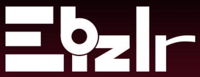
And if you’re wondering, Yes, EBizlr’s logo was also built using Inkscape.
Inkscape is also ONE of the 78 blogging tools that can seriously impact your blog’s growth.
Blog logo design process
Prototypes are variations of different logos you can think of. It’s good to put every idea in your mind onto Inkscape and then compare them side by side.
1. Typeface and Font
Write out your business name on Inkscape. Copy and paste it several times. For each one, choose a typeface and font of your liking. Also, play with the height and width [It can make a huge difference].
Then compare and see which you like. Create as many prototypes as you want.
Now, keep the 1 you like most [You need to eliminate the rest to ease the overall process].
But don’t delete the rest, just pick the one you like and follow the rest of the process.
2. Shapes and Graphics
Start adding shapes and graphics.
Repeat the process of creating several copies of step 1, and place them in different shapes and graphics you think of.
And then, pick your favourite one and move to step 3.
3. Colour
Repeat copy pasting phase 2 prototypes.
Then start adding in your colours [These should be your brand colours if you’ve already decided on them]. Pick your favourite.
With that, you’ll have your first actual prototype.
Chances are you’ll want to make changes to it. So simply just copy and paste the prototype, make your changes, compare, and choose your favourite.
Keep repeating the process until you fixate on something. In the future, you may want to make changes again, and you can make them.
Most blogs and businesses make changes to their blogs quite frequently, so it’s quite common.
FREE blog logo maker software
A blog logo maker provides you with prebuilt logo ideas, templates, and designs, that you can just directly use or take inspiration from.
All you do is choose from their toolbox [OR prebuilt designs], drag and drop design elements, build a logo OR get ideas to use when making the logo yourself [On Inkscape]. Here are 4 blog logo makers:
- Canva logo maker: It also provides you with FREE PNG and JPG file types downloads of the logo you make on their platform. But to get SVG, and other features like transparent background, you need to purchase their services. To learn how to use the Canva logo maker, read this guide.
- UCraft: It lets you build and download a 600 px wide transparent file for FREE [You can also download a high resolution SVG vector file for $7]
- Hatchful: Shopify’s FREE logo maker. [Note: This logo maker only provides PNG file types for logo downloads, not the highest resolution SVG file type]. To learn how to use Hatchful, view this tutorial.
- Logo.com: Logo.com is a FREE logo maker that provides you with prebuilt templates that you can customize, and later download for FREE. You can also get access to other features for a price.
Blog logo design service
Blog logo design services provide you with freelancers or people who can build the logo for you.
All you need to do is provide the context of what you want, what your blog name is, other details, and requirements, and they’ll build something for you.
You can then go back and forth with them [Called revisions] to make changes until you are satisfied with the logo.
Here are 4 blog logo design services you should check out:
- 99Designs: Check out these reviews on 99Designs
- DesignHill: Check out these reviews on DesignHill
- Crowdspring: Check out these reviews on Crowdspring
- Fiverr: Check out these reviews on Fiverr
AI logo generator
Here are 4 AI logo generators that are NOT FREE but are worth spending to get great logo designs [AND ideas/ inspiration]:
- Tailor Brands: This AI logo generator provides logo designs for a monthly subscription [You can make the logo for free, but downloading the end result will require purchasing a subscription]
- Brandmark: This AI logo generator provides amazing logo designs (Some of the best that we’ve seen), and they have a flat one time fee [No monthly subscriptions]
- Designs.ai: Another AI tool that also provides logo designs for a flat one time fee.
- BrandCrowd: This AI tool also generates great logo designs for a monthly subscription
FREE AI logo creator
Here are 3 FREE AI logo creators that you can use to get countless logo designs without spending a dime [You just need to sign up]:
- MarkMaker: It provides the PNG file type of the logo and the vector file [Vector file opens up on Inkscpae], so you can get whatever resolution you need.
- Adobe AI Logo Creator: Adobe also provides AI generated logos and lets you download PNG file types of the design for FREE
- NameCheap Logo Creator: NameCheap is another AI logo generator that provides countless designs and lets you download PNG file types of the design for FREE
Note: Only use AI tools for things like design generation, but don’t just copy passte whatever it generates. This applies to AI content as well. See our post on E-E-A-T SEO to understand why using AI content won’t be helpful long term.
5 Logo design mistakes
Here are the main 5 logo design mistakes you should avoid when creating a blog logo:
- Using cliches
- Making a complex logo: Complex logos are hard to decipher and remember, so why make a complicated logo? Look at giant blogs and brands, they got simple logos for a reason.
- Making a trendy logo: If you make a logo based on a trend, it’ll die with the trend. Make an evergreen logo so it lasts alongside your business
- Using a LOW quality logo: We’ve all tried using LOW quality logos to avoid putting in some effort. Just use software like Inkscape that will let you build a custom logo and give you the HIGHEST quality for FREE.
- Using stock images in the logo: Why would you use stock images in a logo that is literally representing your business and brand? It should be unique. Because if you place a stock image [Something that is used by everyone & is readily available], your logo will lose its value [Like a stock image].
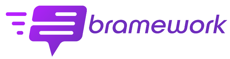
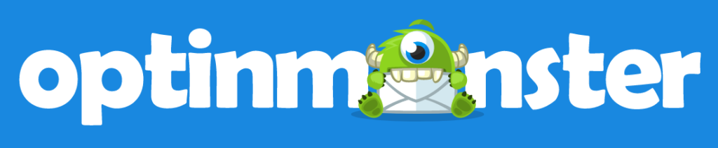
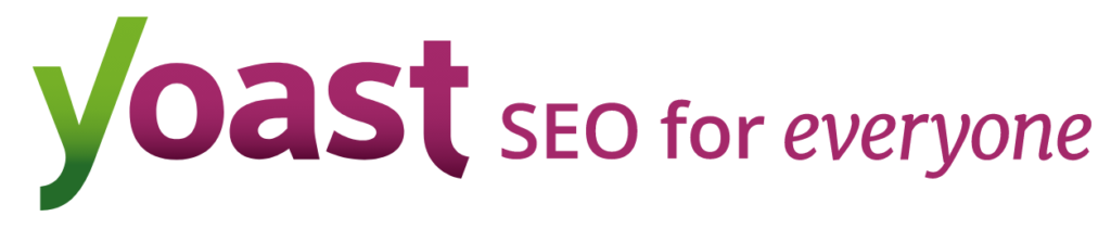
37 Blog logo examples
Here are 37 blog logo examples you can take inspiration from:


FAQ
Yes, a logo matters because it is the core identity that represents any business. It’s what people think of when thinking of your business.
A good logo is unique, attractive, memorable, and easy to remember. It must work great in any size and surrounding.
It should reflect your blog and its purpose. It must be evergreen. People should take less than 3 seconds to realize what the logo is, what it says, and what it means.
And, as a plus, it should look good in black and white shades if needed.
Logo design is important in a business so users can see you as a legitimate blog.
All businesses have a logo, so people subconsciously expect every business they see to have a logo. Plus, over time, a logo helps build recognition.
The logo is seen often when someone interacts with your business, and it gets memorized over time as your business’s and brand’s identity.