
Blog Header Design Guide [+ 79 Header Examples]

The blog header is the first element displayed on your website. It provides easy navigation for users to go through your blog posts. Make sure to check out our blog footer guide after this.

The Blog Header Guide
This article will cover all you need to know about blog headers. From best practices to countless examples. Keep reading.
Create a Header on WordPress
[This setup is done in the Kadence theme. The setup process should be similar and independent of them with minor variations]
Go to WordPress [Haven’t installed WordPress? Check out our guide to setting up a blog].
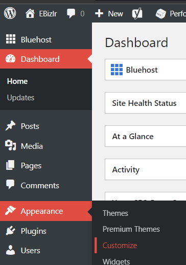
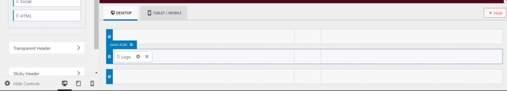
On the left sidebar, hover over Appearance, and click on customize in the side dropdown:
Then, click on the header in the left sidebar.
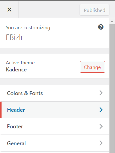
You will then see the following sidebar [Check out our blog sidebar guide]
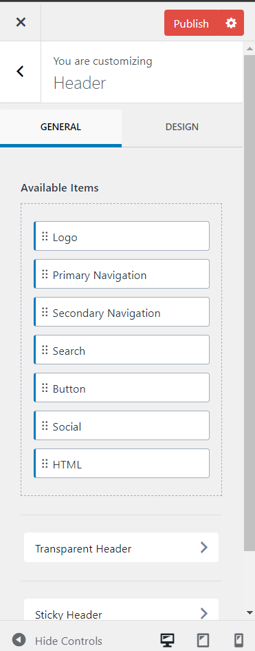
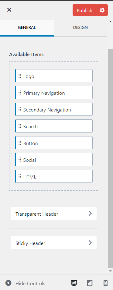
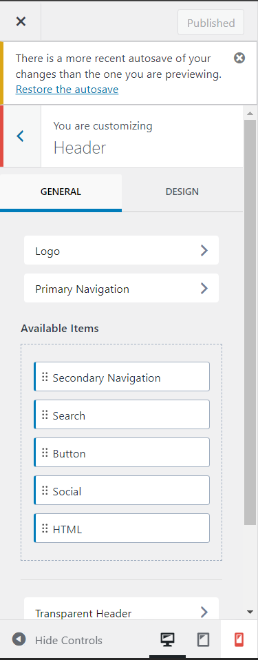
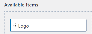
The available items are elements you can add to your header. They include:
- Logo
- Primary navigation
- Secondary navigation
- Search [To display a search bar]
- Button [For a call to action]
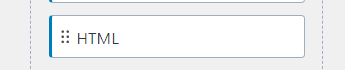
- HTML [To create custom elements. This section requires coding, so unless you know to code, ignore this]
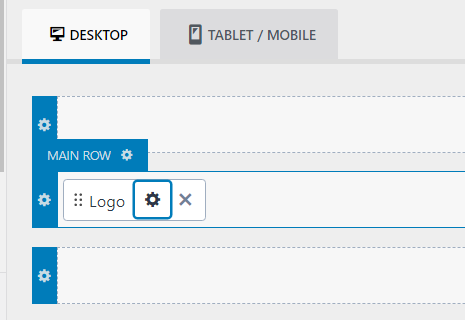
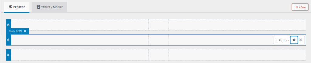
To add the elements to the header, click, hold and drag the element bar to the footer customization belt [Shown below]
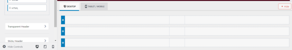
For example, if you want to add a logo: Click, hold and drag it to wherever you’d like to see it in the header [Dispalyed below]:
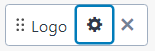
To edit the elements, click on the gear icon which represents the setting for that specific element
Scrolling down, you will also find the following options:
- Transparent header
- Sticky header
The sidebar has two tabs: The General and Design tabs. Click on the design tab:
You can then fully customize the header background
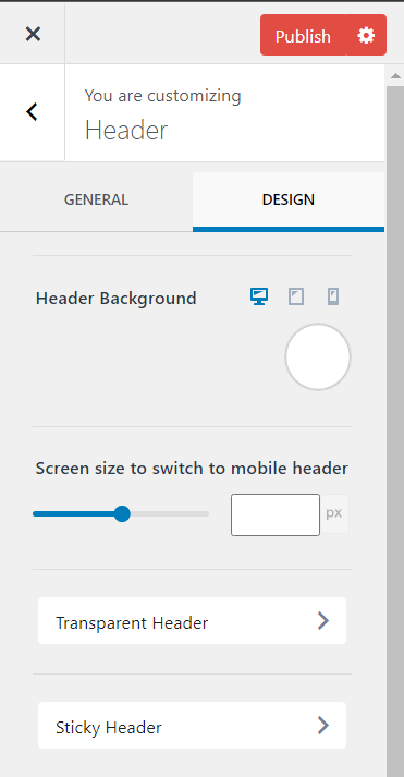
You can also select at what screen size should the desktop version of your header change to the mobile version of your header [If your desktop and mobile header are different].
To customize the design options of the specific elements in your header, you must click on the gear icon for those elements to access their specific design tabs.
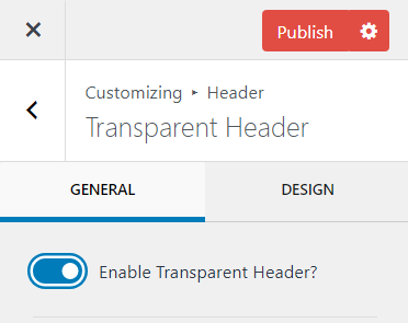
How to make a transparent header in WordPress
Click on the transparent header, and then toggle the enable transparent header:
Which will then display more customization options
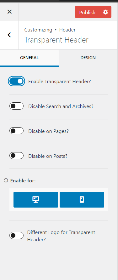
The further customization of the transparent header allows you to disable the transparent header on
- The search page
- The archive page
- All pages
- All posts
You even have the option to display it on desktop and mobile. You can either display it on a desktop, mobile, or both. And of course, you can have a separate logo for the transparent header.
The separate logo activates when a user starts scrolling on a page [Which is also when a transparent header activates].
Keep in mind, a transparent header is a sticky header by default.
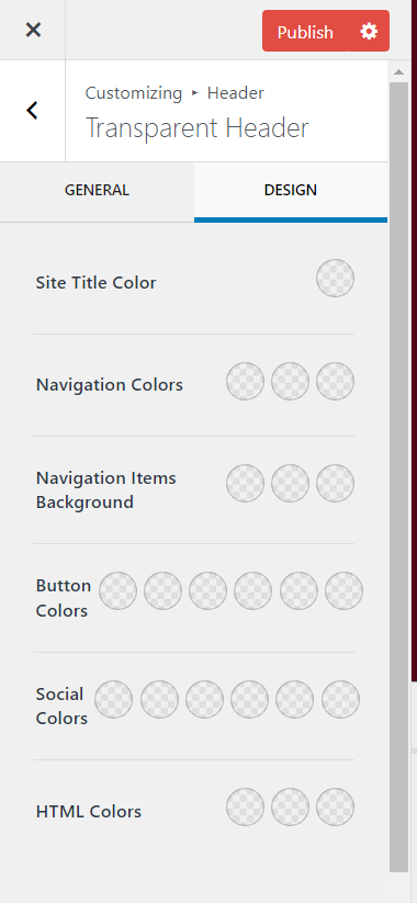
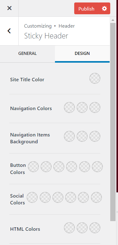
Click on the design tab, which lets you fully customize the colours for the following:
- Site title colour
- Navigation colours
- Navigation item’s background colour
- Button colours
- Social icon colours
- HTML colours
How to make a sticky header in WordPress
Click on the sticky header and then open the dropdown for ‘enable header’:
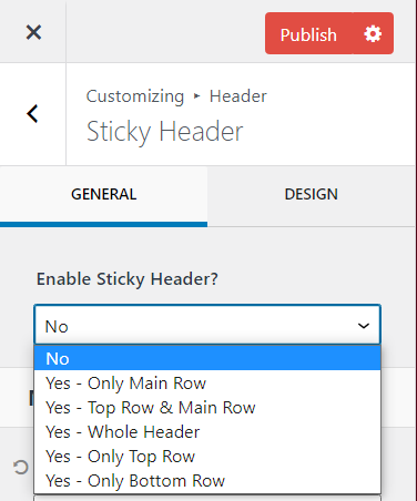
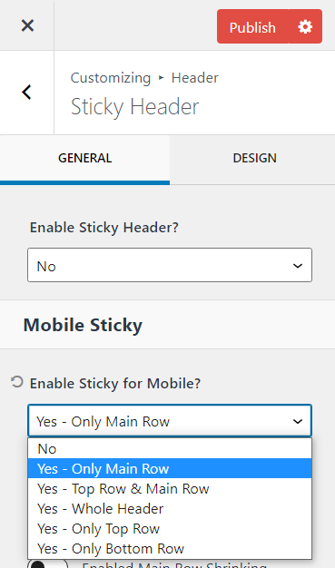
And choose the type of sticky header you want. You can also enable a sticky header for mobile and can choose from the same dropdown options:
You also get 3 more customization options
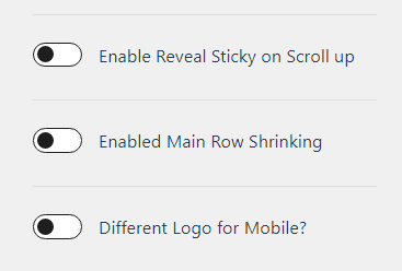
The first option ‘Enable Reveal Stick on Scroll up’ sets the sticky header to only activate when a user is scrolling up. So, the header pops up when a user scrolls up
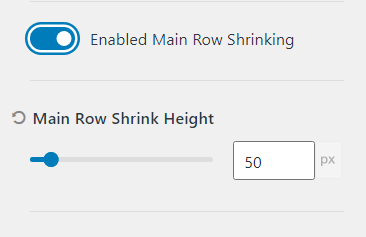
The second option ‘Enabled Main Row Shrinking’ sets the stick header to shrink in height so it takes less space on the screen. This option is great if your original header is large in height.
This will automatically shrink the header when a user scrolls. Upon toggling the main row shrinking option, you get to choose the shrink height [Shown below]:
You also have the option of displaying a different logo for mobile.
Click on the design tab, and you will be able to customize colours for different elements [The same as in the transparent stick header design tab]:
But you will also have the ability to change the stick header background.
And you can set up a sticky header border for the bottom of the header [To make it easier to differentiate where the header ends and where the page starts when scrolling].
Make a mobile header
Keep in mind, for most of the above design customizations, they can be done separately for mobile. Simply click on the mobile icon at the bottom of the sidebar to customize everything for mobile.
Blog header design guide
Follow these guidelines to build industry proven guidelines [Some are optional depending on the number of links or type of site you have].
Use proper spacing within the blog header
The header is the thin bar at the top of the screen.
It should be clear and concise. There should be enough spacing between elements.
For example, the logo, navigational links, as well as the Call To Action need to be spaced out.
There are no spacing values set in stone you should follow.
But, a good measure is to keep sufficient distance between elements, where it’s clearly visible that there are 2 separate elements.
Simply put, there should be enough spacing so that 2 elements don’t look like they’re part of a single element in the blog header.
Padding between header boundaries & elements
The elements inside the header should have enough background padding above and below it.
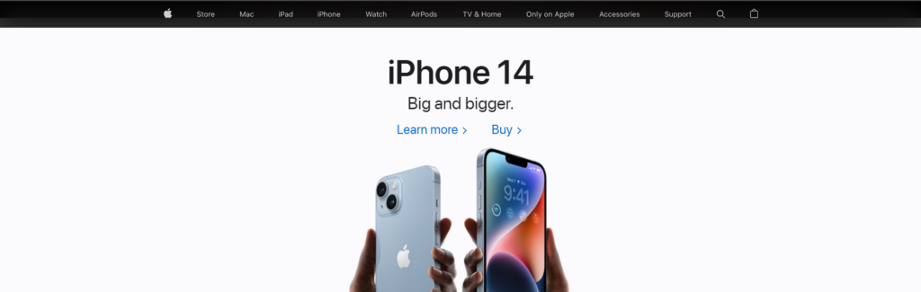
For example, take Apple’s header. All the elements look neat and spaced out. And, there is a good amount of space between the elements and the background’s upper and lower boundaries.
You could even have a lot more space than Apple’s header does, like the example below. It’s all based on personal preference.
Make header elements highly visible
Visibility is important to make it easier for people to read and process what they’re seeing. In fact, it has only become more important to have high visibility due to accessibility issues for people with disabilities.
So, having high visibility is no longer important for high visibility, but to also avoid legal issues [You don’t want some Karen to sue you for having a yellow font on a white background].
Readability affects blog post SEO [Check out our Blog Post SEO guide to find out the 7 SEO ranking factors]
Increase font readability
Use simple fonts like Arial or Times New Roman that are easy to read. In fact, this header element font should be the same as your content font [Assuming you’re using a highly readable font for your content].
Nothing fancy. Take it a step further and make the text bold to increase visibility.
Have high colour contrast
All the elements in your header must be in contrast with the background of the header. For example, if your header background is white, make your text font colour black. If the background is black, make the font colour white.
Sticky header
[Optional]
A sticky header sticks to the top of the webpage independent of how much you scroll. The purpose of a sticky header is to provide you with immediate access to navigation.
It is also used as a method to increase the click through rate on a call to action. If you add a call to action in a sticky header, it will be displayed to the user the entire time they’re on your site, which is great advertising.
Here are the guidelines you need to follow when using a sticky header:
Sticky header guidelines
There are two main sticky header guidelines:
Make it sleek
Since it will be stuck to the top of the webpage, it will be consuming space. Therefore, it’s a good idea to make it sleek, so it takes as little from the screen space as possible and doesn’t end up irritating the user.
This may mean a reduction in your current header height. This also means a reduction in your logo size [Usually the header is more significant in height to allow more space to increase the logo size].
For this, you can always create a separate header [As mentioned in the header design guide above], that turns on the moment a user scrolls a certain distance.
This way, you can have a big header initially to show off your logo and call to action, and when the user starts scrolling, it becomes really sleek, to still show navigation [and a smaller logo & call to action].
To provide an actual range for a sticky header, its height should be in between the range of 40 – 100 px. You can always test it out yourself, and see what height you prefer [Get user feedback as well].
Don’t make it stand out
Ensure the colours are close to neutral, or that they don’t stand out. The sticky header should be there to provide quick access, but it shouldn’t become a distraction.
Avoid using fancy header backgrounds visuals or colours. Stick to using a plain colour. And make sure there is still some padding in between the header boundaries and elements.
Transparent header
[Optional]
A transparent header is transparent, so you can see what’s behind the header. This is a great visual effect for visually heavy sites. Because it adds an extra level of cool to the overall user experience.
At the same time, it’s not the best for every site. Regardless, there are certain guidelines to follow when using transparent blog headers.
Transparent header guidelines
There are two main transparent header guidelines:
Have high contrast
If your header is white or a light colour, and transparent, stick to using stark black as your font colour to ensure maximum contrast between the header’s transparent background and text.
Since the header will be transparent, there may be times when the header will pass through colours making it hard to see the text in the title. The best way to avoid that is to use a dark black font.
For more robust measures, make the text bold for increased visibility.
If your header is black or a dark colour, and transparent, stick to using stark white as your font colour to maximum contrast. And, bold the text for increasing visibility.
A transparent header is a sticky header by default
This is obvious, but if you’re using a transparent header, it needs to be a sticky header. But, because of this, all guidelines that apply to sticky headlines must also apply to transparent headlines
Add hover effects to header links
Hover effects are typically changes to the link’s colour which makes it more obvious to users whether they’re hovering over a link.
The hovering colour can be a lighter or darker tone than the original colour, or it can be drastically different.
For example, if the original link colour is white, you can have the hover colour be a grey tone or stark black.
Instead of the link colour, you can even have an underline as the hover effect. So, when a user hovers over the link, it gets underlined.
Only have links in the header
The header should be sleek. It should have unnecessary elements on it. A good way to know what’s a necessary element for a header is to ask whether it’s a link. Unless it’s a link, it doesn’t need to be in the header.
This includes text or headlines. Oftentimes, bloggers place their taglines under their logo. This isn’t needed and takes up unnecessary space. Such text, taglines, and headlines
It’s best to place any text or headlines as part of the hero section.
The hero section is considered above-the-fold content that’s right below the blog header.
Since it should be simple and concise, it’s better to minimize any text and/ or headlines.
It will already have your navigational texts. Don’t overcomplicate the header.
What should a blog header include? [8 Elements]
A blog header should include the following 8 elements at the bare minimum:
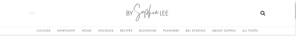
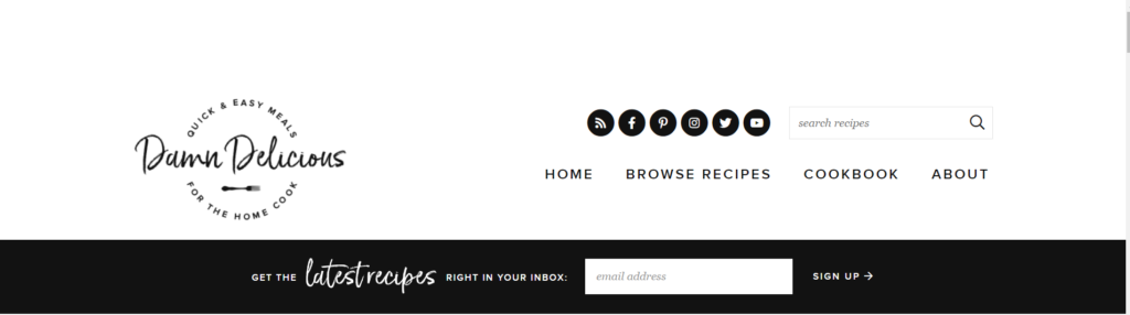
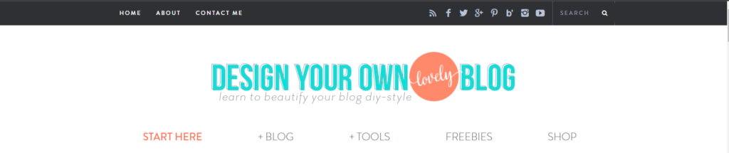
Your blog logo
The blog logo immediately informs users what site they’re on. It’s the easiest way for them to remember you [Other than your blog name].
Check out our Logo Design Guide to make a stellar logo if you haven’t already. Usually, the logo is placed on the left side of the header as shown below

It could also be placed in the center [Not so common] like the one below:
To add the logo, drag and drop the ‘Logo’ bar from the available items
And click on the gear icon for customizing it.
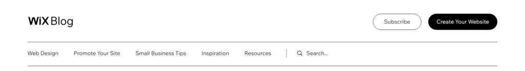
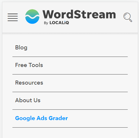
Navigational links
Then, the users must be able to navigate through your site with ease. Which is the purpose of the navigational links. The navigational links are usually in the center and spaced out well [Shown below]:

They can also be placed to the right [Show below]:

The most common navigational links you should have are:
- Home [Takes you to the home page]
- About Me [Takes you to the About page]
- Blog [Takes you to the blog archives]
- Resources [Takes you to a resources page]
- Pricing [Takes you to the pricing page if you’re selling products/ services]
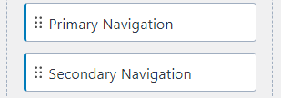
You can add primary or secondary navigational links by dragging and dropping them from the available items:
A call to action
The header is the best place to display a call to action. The header is on all web pages.
So, your call to action will always be displayed to users. A call to action can either get them to sign up for your email list, a free product, a webinar, etc.
It lets users know what you mainly have to offer to them [Other than your blog content]. It is one of the best list building methods in our email list building guide.
In the example below, the header has a call to action in the form of a green box informing people to get started for free

To add a call to action, simply drag and drop the ‘button’ bar.
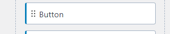
Then click on the gear icon for customization.
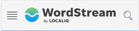
Search bar
Having a search bar or search icon in the header can be quite helpful for blogs or sites that have tons of pages, content, or products.
And the most accessible place to have a search bar is the header. Wordstream uses a search bar in its header as well:

To add the search bar, simply drag and drop the ‘Search’ bar from the available items
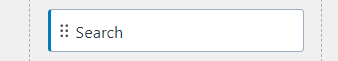
And place it here. You can then customize the search bar by clicking on the gear icon
If your theme doesn’t have a search bar as an available item, check out this guide to set up a search bar.
Shopping cart icon
Shopping cart icons are great for headers where several products are sold. It’s a great way to remind users about purchasing, as well as abandoned carts.
If you’re just a blog with a few products, you don’t need a shopping cart icon. But if you’re an ECommerce website that sells a ton of products [With a blog on the side], then you should have it.
Here are two examples of headers that utilize a shopping icon:


To get such an icon, you would need to create a separate widget and then add it to the header. Check out the following guide to set up a shopping cart icon in your header.
A login
The login element is needed if you provide access to special content, products, or services that users had to register or sign up for.
It can provide access to subscription based content [One of the 9 methods we cover in our blog monetization guide].
A login can be set up in the same manner that a call to action is set up [Using the button tab].
Or, check out this guide to set up a proper login popup.
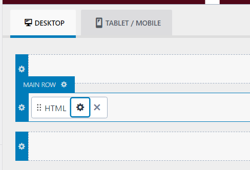
Once you get the unique shortcode [Which is HTML] for it, you can easily add it to your header by dragging and dropping the ‘HTML’ bar from the available items
And then click on the gear icon
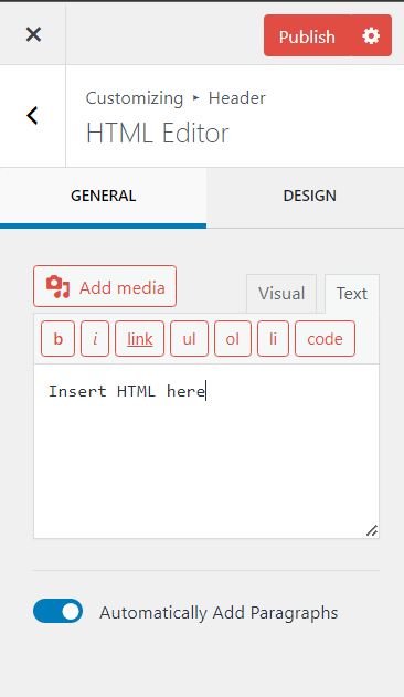
You can then add the HTML shortcode under the text tab
For example, from the guide [Linked above], I took their shortcode
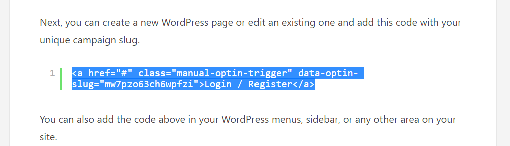
And simply copy paste it into the HTML
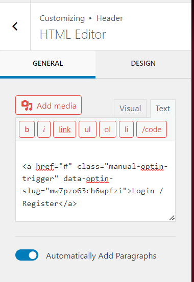
Which displayed the following login/ register link.

Social media links
Social media links can also be placed within blog headers. Gathering traffic from social media is on of the 15 methods we discuss in our guide to increase blog traffic.
These links are usually placed in headers when that blog social media wants to be specifically promoted.
As in, the blog wants users to know about their social media pages and follow them there.
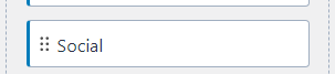
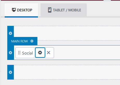
To add social media links, drag and drop the social bar
And click on the gear icon to customize the social media icons and links
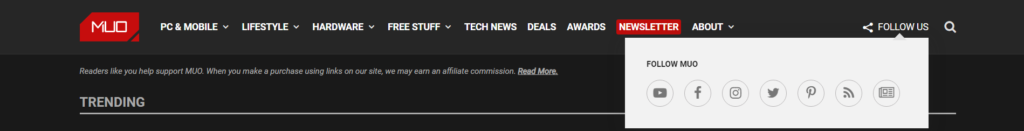
The example below displays social links in the header as a dropdown
Here is an example of a header that displays several social media links
Accessibility modes
There are several accessibility features you can provide to users, but here are two that can easily be provided.
To set up accessibility features, the easiest method is to utilize accessibility plugins.
Language switch
A language switch widget allows users to change the language of the content displayed. So, if they aren’t fluent in one language, they can switch to one they are fluent in.
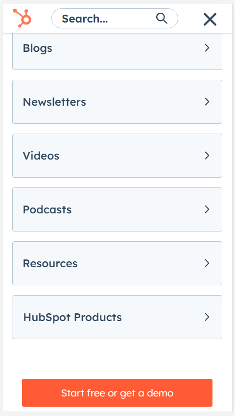
Colour contrast switch
A colour contrast switch changes the contrast colour combinations on the site which certain users will find easier to view. Hubspot has a colour contrast switch in their header as well [The toggle feature]:

Below is the display before the toggle is on:
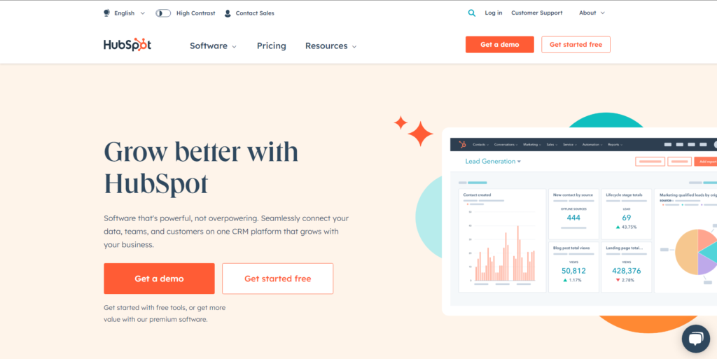
And below is the display after the toggle is on:

You will need to create a widget that includes these accessibility features and then place it into your header.
What is a blog header?
The blog header is the top bar on a blog or site.
Many confuse the header with the ‘above the fold’ content. ‘Above the fold’ content comprises the header and hero section.
The hero section is under the header. for example, here is a blog post by backlink. Below is what you’d see when you’d enter the web page:
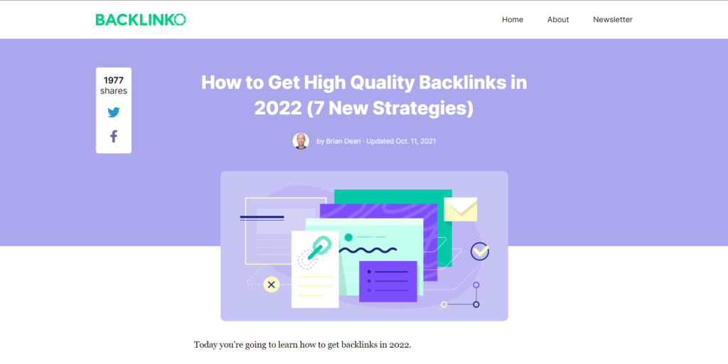
And below is what’s considered the header of the blog:

Where the hero section is considered what’s under the header [Show below]:

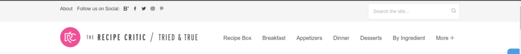
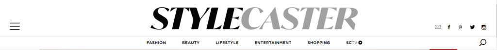
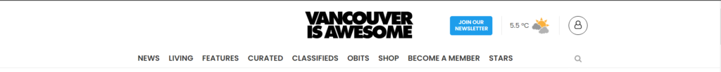
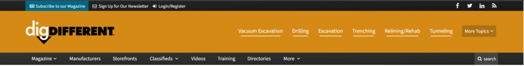
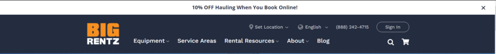
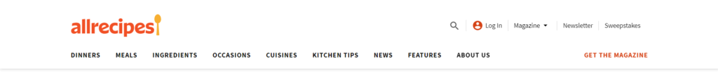
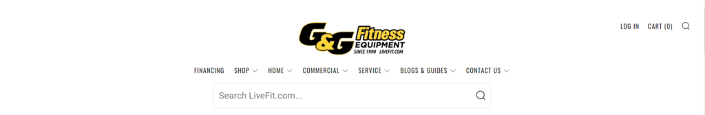
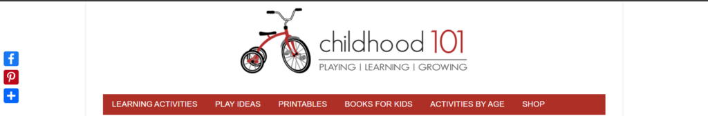
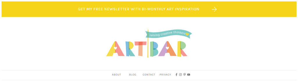
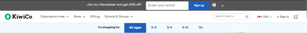
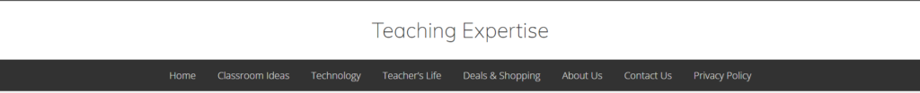
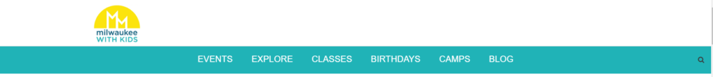
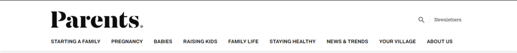
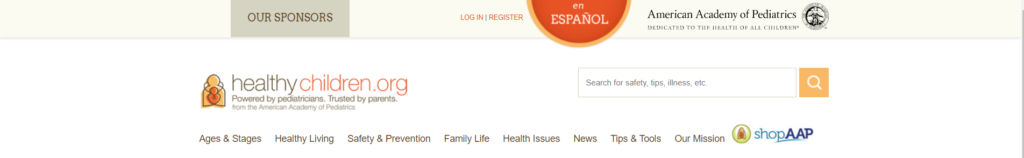
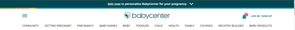
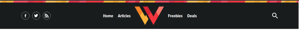
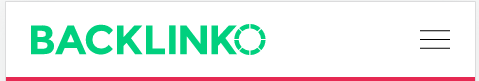
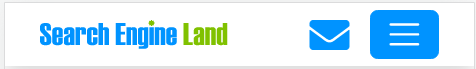
65 Blog Header Examples
Here are 65 examples of blog headers:


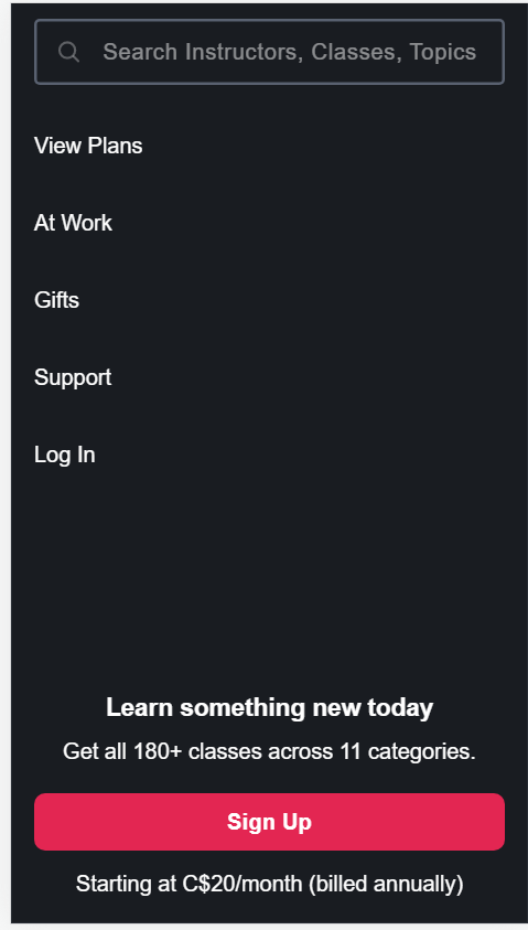
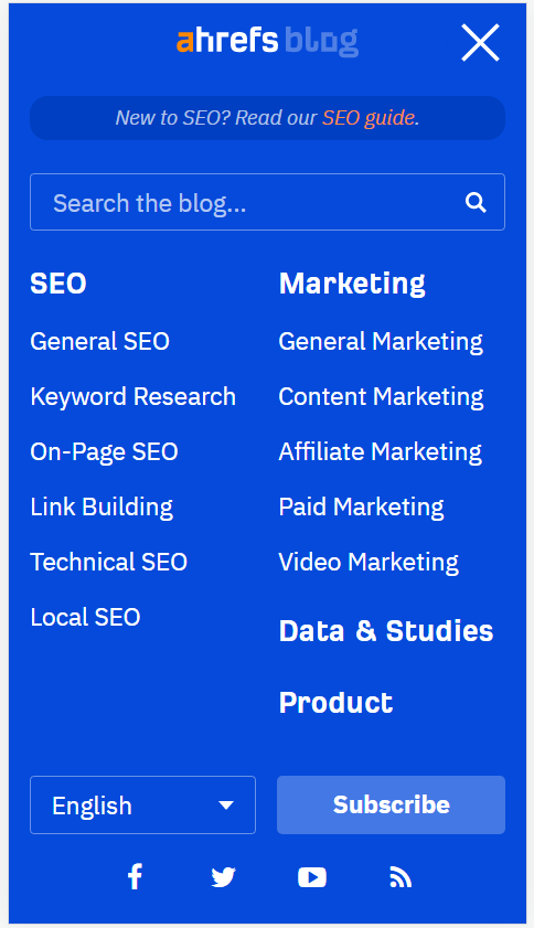
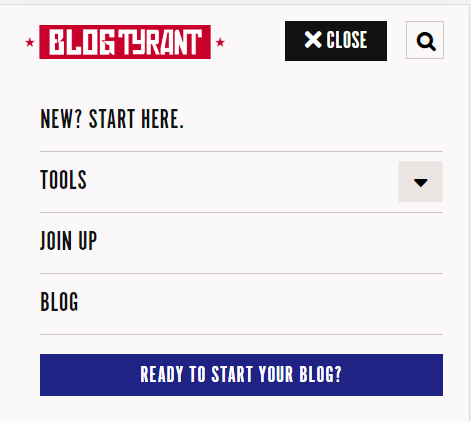
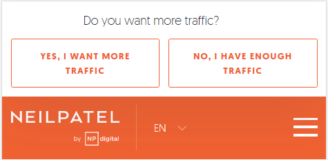
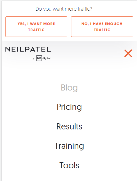
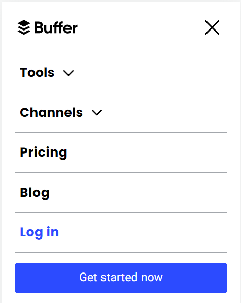
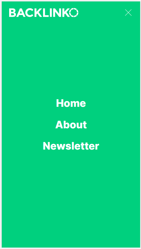
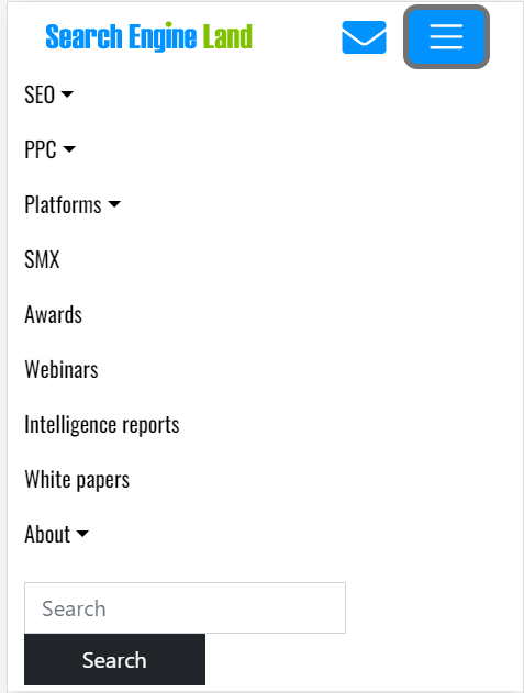
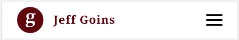
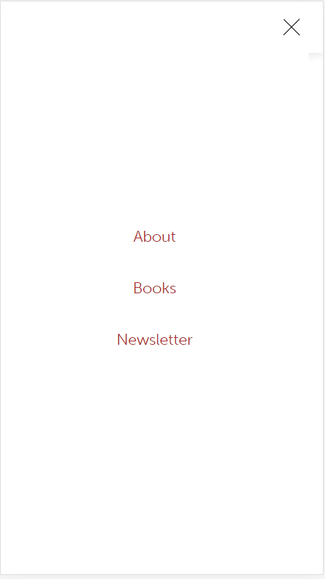
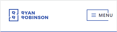
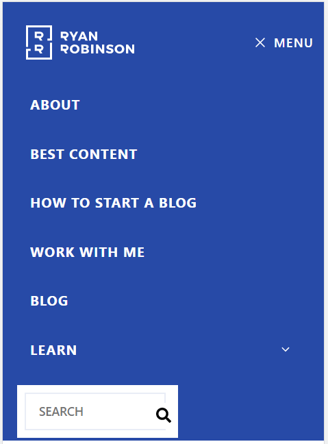
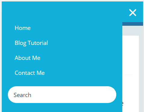
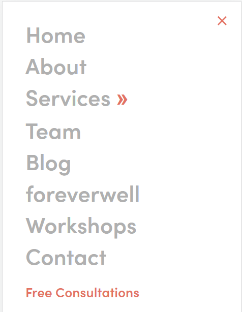
14 Mobile Header Examples
Below are 14 examples of mobile headers along with how their menu looks like when it is opened.


FAQ
Yes, every website needs a header. It is a mandatory part of the website that makes it possible for users to navigate through the site.
A good header height should be in between the range of 40 – 150 px
The header is the navigation bar at the top of any site. Whereas the hearo section is the section right below the header on any page. Both header and the hero section generally make up the ‘above the fold’ content of a web page.
No. Headers should be small and compact while not being congestive and easy to navigate through.