
Blog footer Design Guide [Includes 72 Examples]

The blog footer, of any site, is often overlooked.
Because it’s at the end of the page, and most users don’t even reach that point, it is often neglected.
But, having a powerful one that is visually appealing and with the right content, can increase your credibility.
It will also get you more user session time, and ultimately, more leads.

The Blog Footer Guide
This article will cover how you can make a blog footer, and what it should include. One step foot at a time. Keep reading.
Setup a footer on WordPress
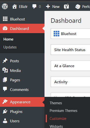
Go to WordPress [Haven’t installed WordPress? Check out our guide to setting up a blog].
On the left sidebar, hover over Appearance, and click on customize in the side dropdown:
In the new display, click on the footer in the left sidebar:
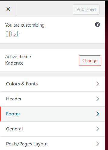
This next display may differ based on the theme you use [The examples displayed in the pictures used the Kadence theme].
But, you should see the following three options: Footer navigation, Copyright, and Social.
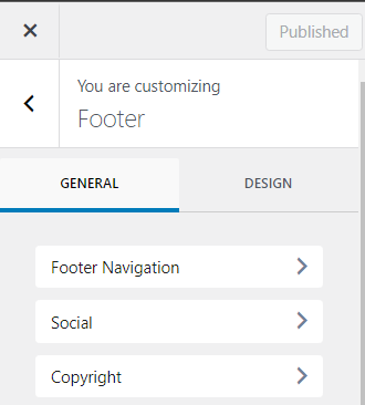
Clicking on the Footer navigation will let you customize the overall footer.
Click on Social. Give the social section a title like ‘Find us on social media’ [You don’t need to have a title].
And place them in all your social media accounts with their respective links.
You will also get further customization options [Don’t forget about the design tab that gives you visual customization options].
Lastly, click on Copyright, and input your copyright text.
Plus, you can add a lot more options, and you are free to decide where you want it to be displayed in the footer with the following customization feature:
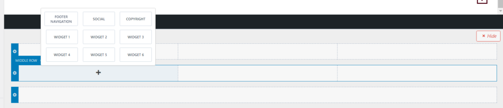
It’s a simple layout that mimics the footer, to let you organize elements in the footer.
Simply click on one of the plus icons to get the popup [See in the screenshot above], which lets you add anything.
Widgets are elements you can make and fully customize. So, you can technically add whatever you like to your footer.
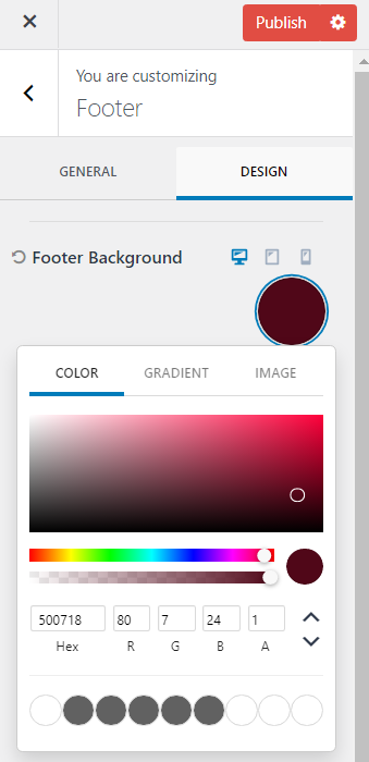
To edit the background of the footer, simply click on the design tab where you can have whatever background you’d like [The Kadence theme lets you have the background be a colour, gradient, or even an image].
And that’s the end of the blog footer setup tutorial. Keep reading for best practices.
Blog Footer Design Guide
Here is a quick guide to making a good blog footer:
Background of your blog footer
The background should follow a similar style to your overall website. Style refers to the site’s colours and theme.
Don’t base it on a single page. Because the blog footer will be present at the bottom of every page.
The most common blog footer background is having a single colour or a colour gradient.
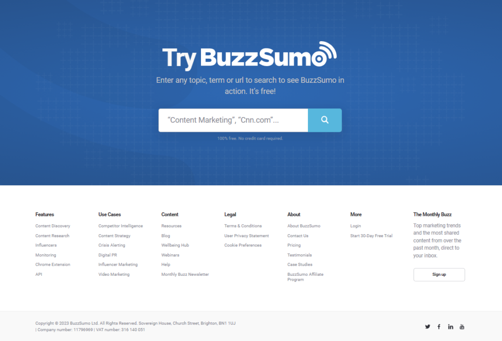
Here is an example of a blog footer background:
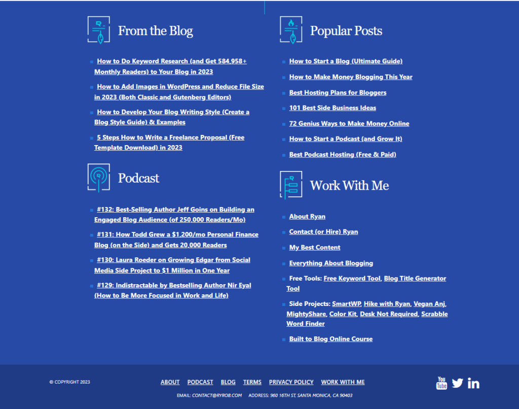
This is Backlinko’s blog footer and has a single colour background

Have high contrast between text & background
Make sure the text is easy to read. It should have a high contrast with the background colour.
Above you can see in Backlinko’s footer, Shades of white are used in contrast to shades of grey.
Certain words are less visible [That have a grey font colour] but that was intended to not overwhelm the eyes with too much white.
Imagine if all the words had the stark white font colour. It’d be too much to look at.
And when a reader hovers over the words, they brighten up to the stark white colour. Here are other examples:
Blog footer example
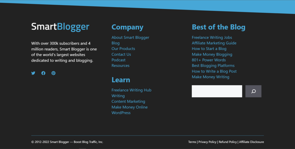
This is Neil Patel’s blog footer and is also a single colour. Take note how there is high contrast in terms of colour, but because the text is so thin, it has low visibility. It would be far more visible if the text was bold.

Blog footer example
This is WordStream’s blog footer and is a great example to demonstrate high contrast between text and background.

Blog footer example
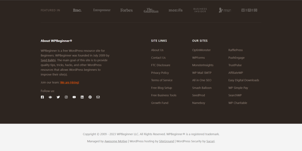
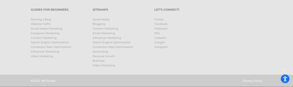
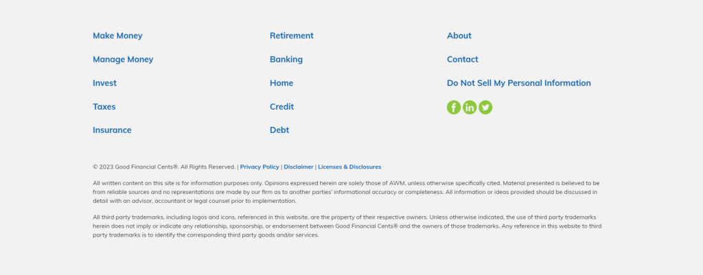
This is WPBeginner’s blog footer. There isn’t high contrast here, but it is all fairly visible. There are two colours used here: A shade of brown, and beige.
Typography of your blog footer
The typography includes the font, font size, and font colours of the text.
The typography should be the same as your general website. Make sure the typography is easily readable like the typography in Word Stream’s footer. Avoid typography that’s barely visible like in Neil’s footer.
Use a ton of space
The footer can have all the space it wants. And it should be well spaced out to avoid clutter.
Space is quite important because there are usually an immense amount of links.
And that is quite overwhelming. But pairing it up with the proper organization and enough space will neutralize that problem.
See WP Beginner’s footer, it takes up a lot of space. So, despite having so many links, it doesn’t look cluttered.
Stop overusing link underlining
When a link is underlined, it stands out a lot more. Which can be good if you want certain links to stand out.
But overusing it actually makes it overwhelming and cluttered. So keep the underlining to a minimum.
See Word Stream’s links. They have just underlined the headers of the different categories [That aren’t even links]. That makes the different sections more obvious
Use a Drop Down for links in the mobile footer
Make sure to see your footer on mobile. Don’t be that blog that leaves their links as is from their desktop version to the mobile version. Ensure your mobile version has a dropdown feature, so the footer is sleek and compact, and not just a huge list of links [Mobile footer examples coming up]
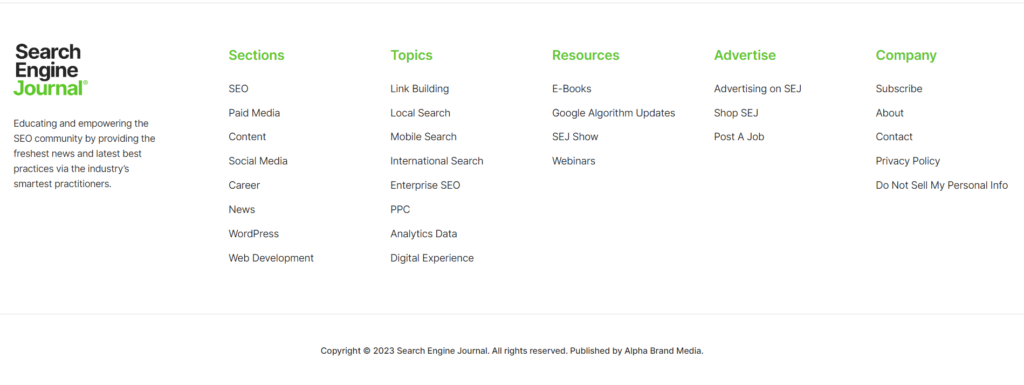
What links to include in your footer?
The blog footer’s purpose has been to have all the necessary links a user might want to check out.
All in one place. Now, don’t clog it with an excessive amount of internal and/ or external links.
Only keep the links that are most commonly searched for, as well as, your header navigation links. Check out our blog header guide that covers best practices to build a simple yet impactful header.
You can determine which links are the most sought on your website by checking out your analytics or search console page.
Just take note of the most common pages users visit. And add those to the footer. Those links should also be added to your sidebar. Check out our guide to building an epic blog sidebar that converts.
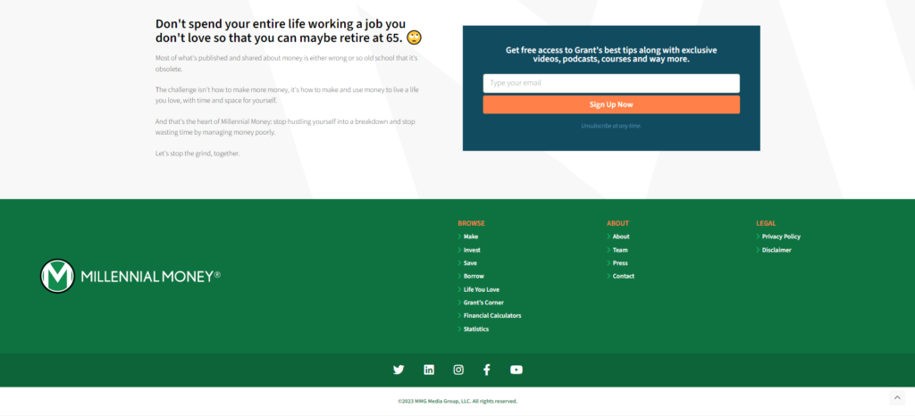
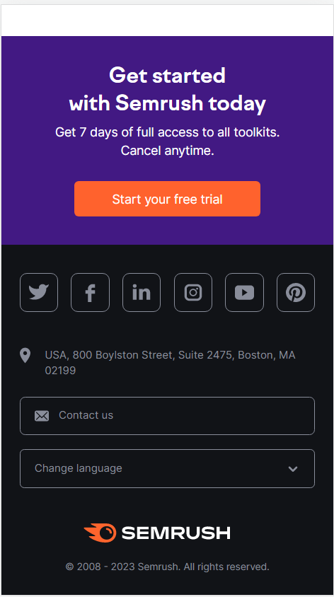
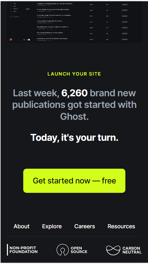
A call to action link
The call to action for your blog should be placed wherever possible.
And, it should especially be placed in the blog footer.
Because it’s where users who are invested enough in your site, will come to check out more information about your site.
If you have the call to action available in the footer, they can be a click away from becoming a prospect.
Consider a secondary sticky blog footer
A secondary sticky footer will be stuck to the bottom of the screen independent of any scrolling.
Such blog footers are great to display calls to action consistently to the user while they’re going through your site or blog post content. Here is an example of a sticky footer:

Have an email sign up
The footer can also be used to gather more emails. Get people to sign up with a call to action. Check out our listbuilding guide to learn more about using call to actions to get emails.
The blog footer is THE place for links to legal pages
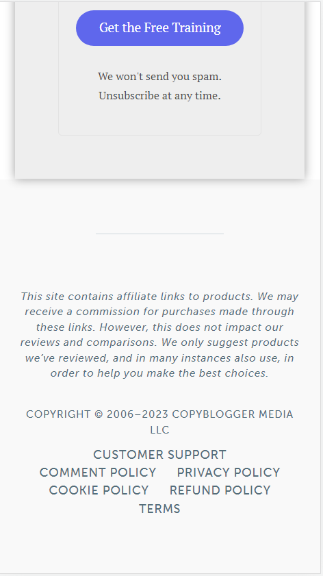
It should also include links to all your legal pages. This includes the following 3:
- Privacy policy
- Terms of use
- Disclaimer policy
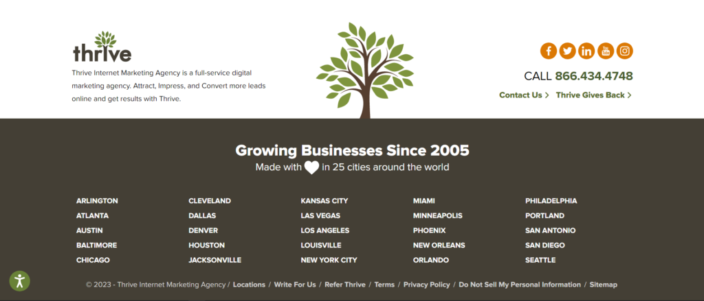
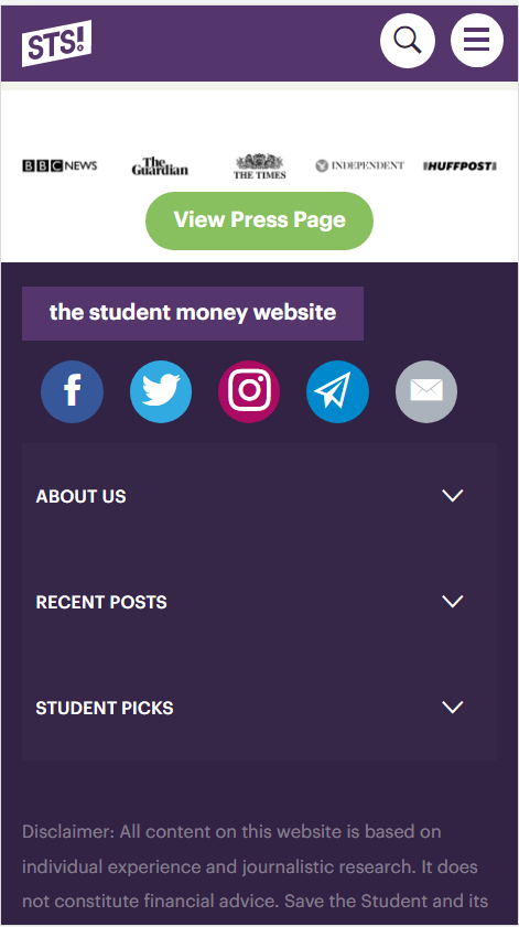
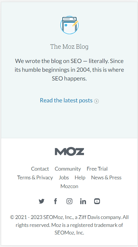
Social media links
Social media links are always a must have in the blog footer. The footer is usually where users go to find a business’s social media.
Instead of just having links, make sure the links are embedded in the logo icons of the respective social media. Read our blog logo guide to learn the best practices to make a quick and powerful logo.
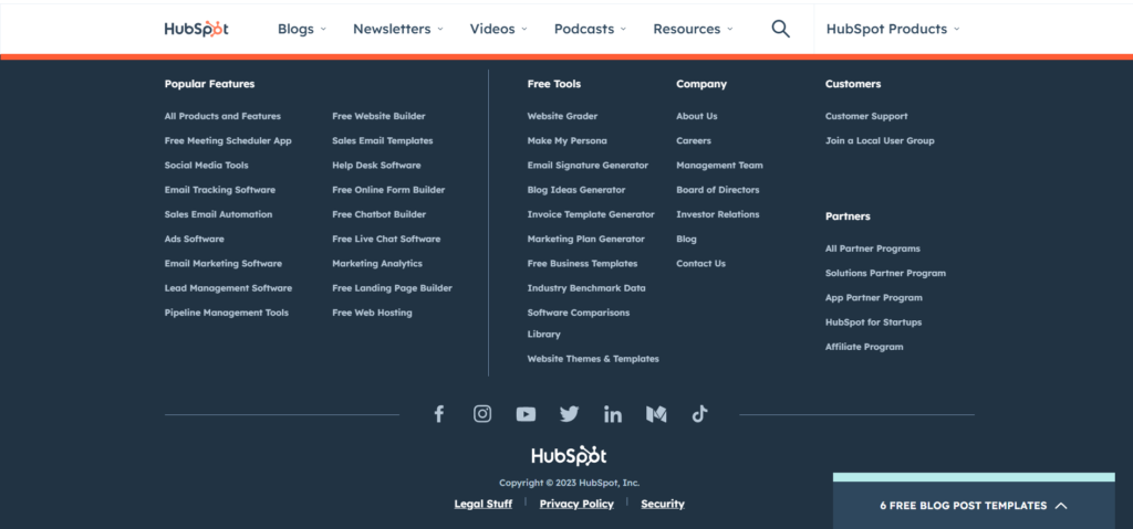
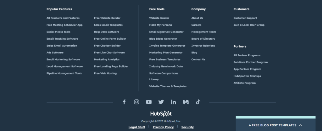
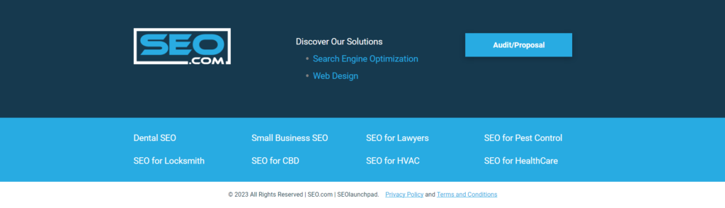
Almost all websites have their social media icons in their footer. So, you should too. Here is an example of a blog footer [Hubspot], that displays its social media links extremely well:
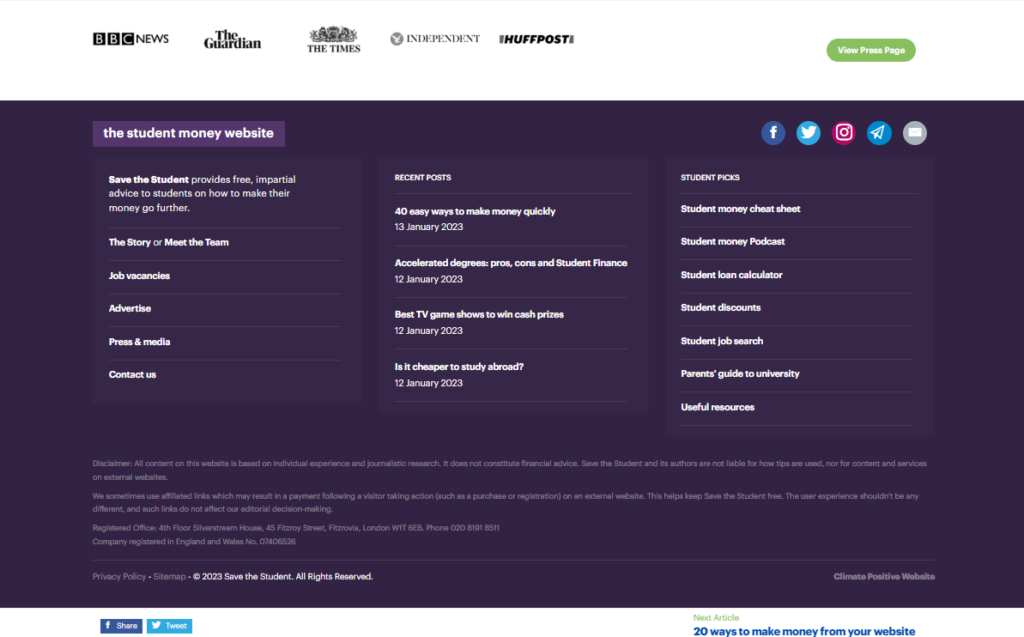
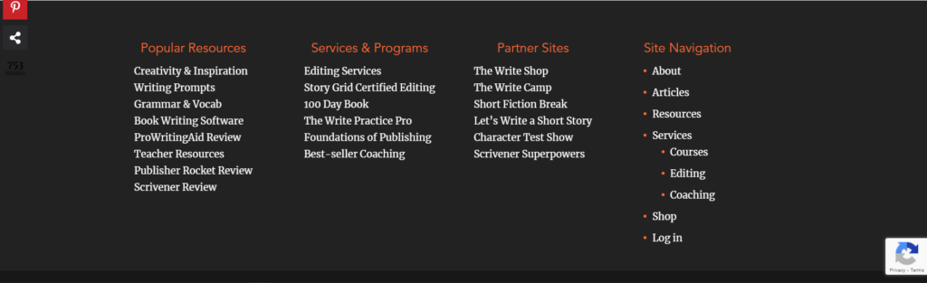
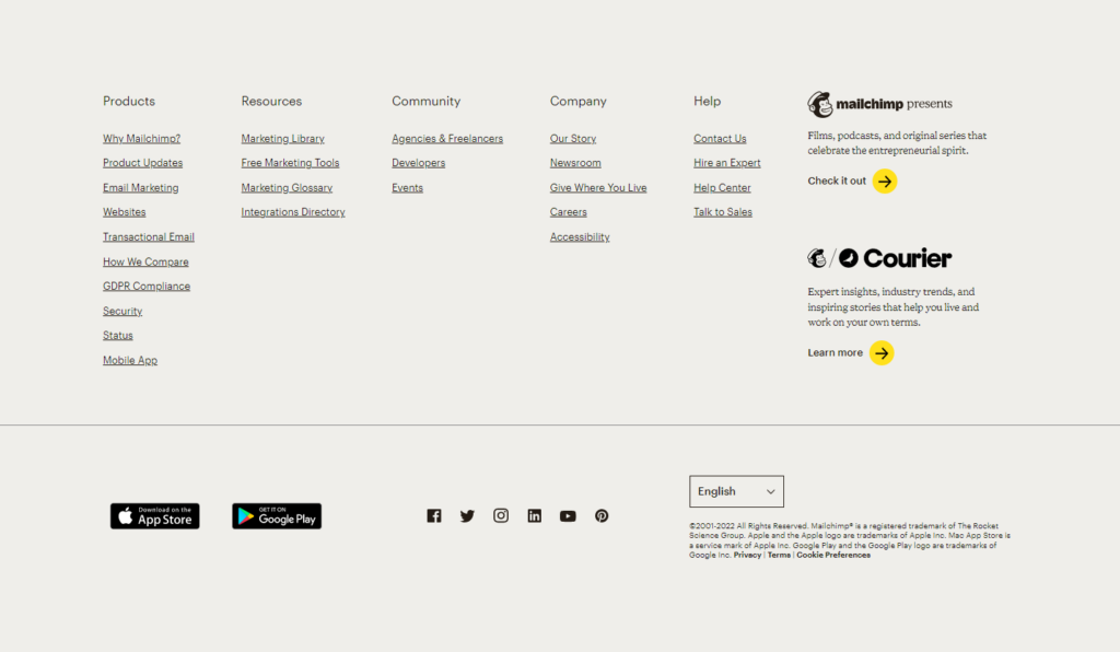
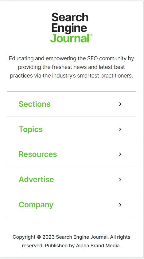
Organize links to make them user friendly
Depending on the website, you might end up with several links.
And that will be quite confusing to go through, especially for users.
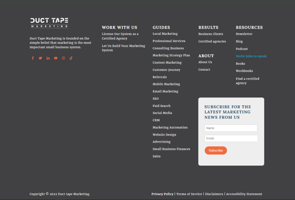
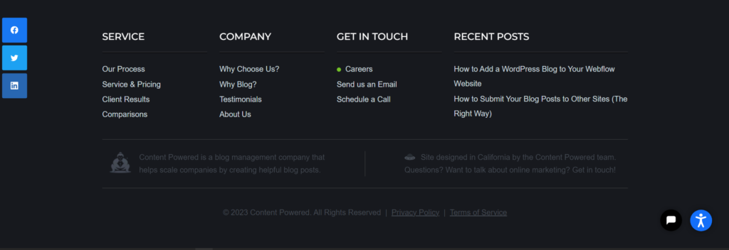
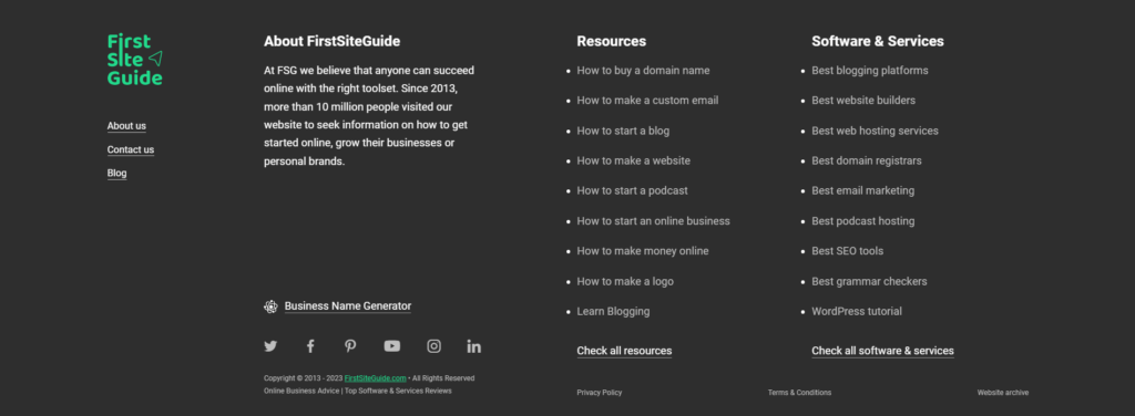
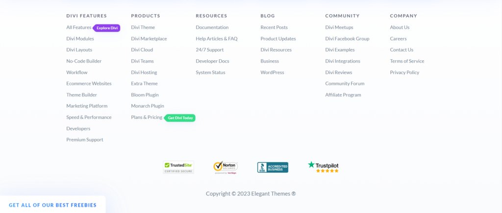
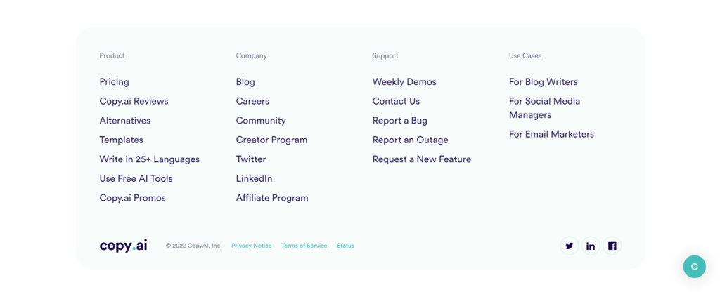
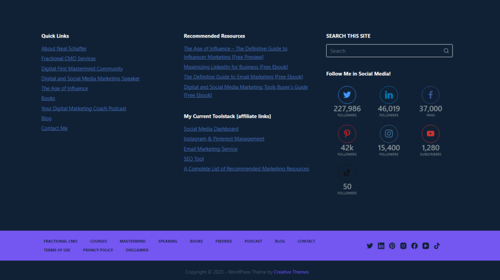
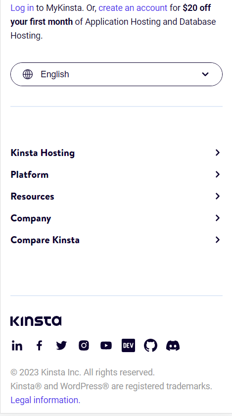
So, create columns, and rows, and organize the links into groups. Here are popular groups that links are usually organized under:
- Resources [Links to Free OR Premium tools]
- Resources [Links to blog, whitepapers, case studies, PDFs, templates]
- Partners [Links to partner pages, partner program signup]
- Company [Links to about us, Careers, Contact us, team about us]
- A separate section to display legal pages []Privacy policy, terms of use disclaimer, etc]
A great way to seek guidance on organizing the links is to go check out as many blog footers as possible. You can check out their footers while doing a blog competitor analysis on them as well.
What should you put in the footer of your blog?
The blog footer should have more than just a list of links. Here are other elements to grace your footer with:
Contact information
Contact information is content that you always want to have readily available for your users.
And so having it on all your pages would be the best solution.
But, sometimes, having contact information in the header may not look the best.
So, the best place to place your contact information is in the blog footer.
What contact information should you include?
- Name: The name of your blog
- Business address [with link to Google maps for directions]: If you have an in-person location, it’s best to display it in the footer so users have easy access to it
- Phone number: Your business number
- Email: Your business email
Is this required for all blogs? No. But if you a solar blogger, and want to potentially be reached out to by companies who want to hire you as a freelancer, this will make that happen with a higher probability.
Have a copyright notice
Every website, not just blogs, has a copyright notice within its footer.
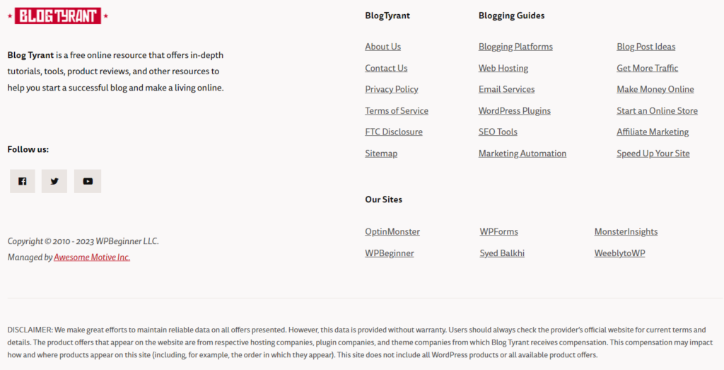
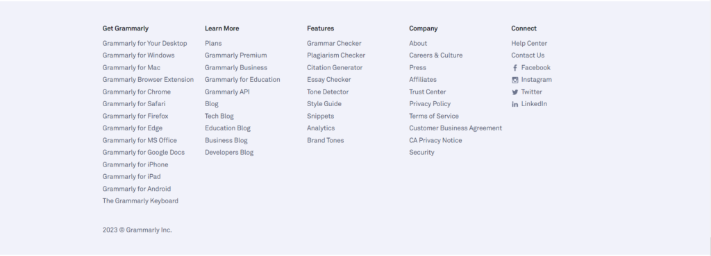
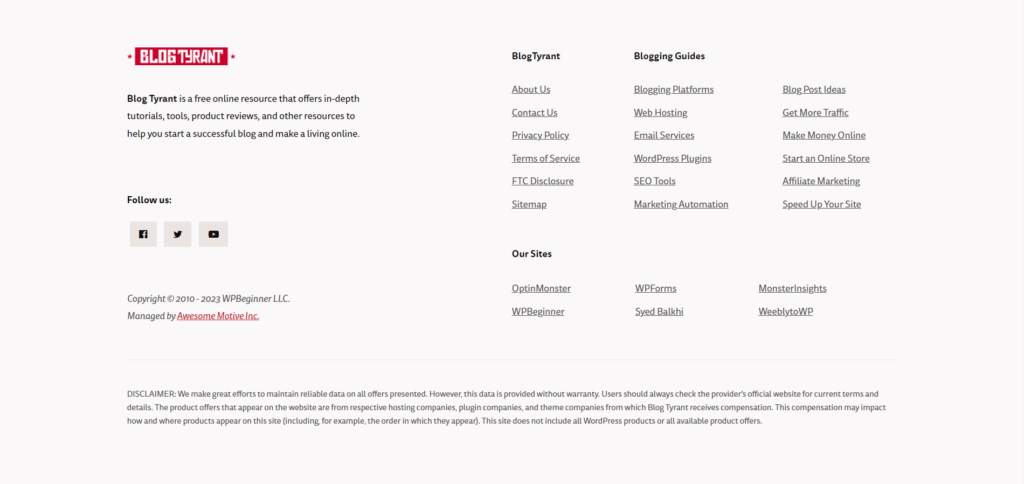
A simple ©, copyright icon along with your business name is needed. So, no one will plagiarise your site. Check out the copyright notice of Blog Tyrant:
Add your logo to the blog footer
Having your logo within your blog footer helps with the overall branding of your site.
Having the logo present in more places will give users more experiences in remembering it. Not to mention that it looks cool. Remember Backlinko from before? See how their logo makes their footer so much better:
Have a site search tool
Having a site search tool can be beneficial if your site has a product catalogue or several pages.
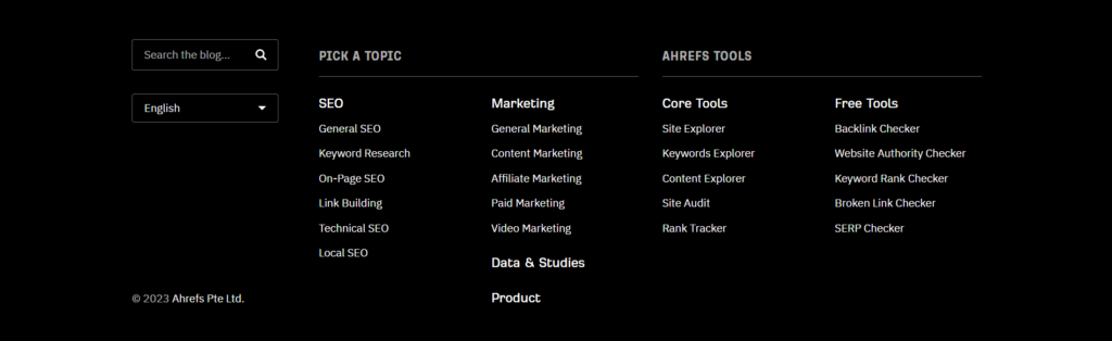
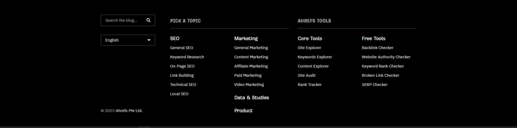
It will be much easier for a user to use the search bar to search through your blog/ website. It’s not necessary but a nice add on to the footer. Check out Ahref’s footer and their site search bar:
Show off your certifications/ awards in the blog footer
Since the footer is part of all pages, showcase your certifications, awards, and even any membership logos.
This provides more credibility to your site, and immediately builds more trust for you.
Remember WP Beginner from before? They also show off their awards and features in the form of a bar at the top of the footer.
Blog footer SEO
The footer should have all your main keywords [Don’t overstuff], since it is part of every page, and will provide a small SEO boost.
It’ll be a small boost because, in the past, websites have abused the algorithm by overstuffing the footer with keywords.
So, now, Google doesn’t consider the links in your footer to have as much weight as they do in the body of your web page. In fact, if you do bother abusing your footer by spamming links in it, Google will penalize you.
Check out our blog post SEO guide to learn the most important & impactful SEO concepts.
Have a link to your sitemap in the footer
The sitemap is a backend page that displays the entire structure of your site. Google search console uses the sitemap to have an idea of your entire site structure.
A sitemap helps with your SEO. So, take your domain, add a slash ‘/’, and then type in sitemap.xml. For example, if your domain is www.ebizlr.com, type in www.ebizlr.com/sitemap.xml
Take this link and add it in your footer to so Google can always have easy access to it.
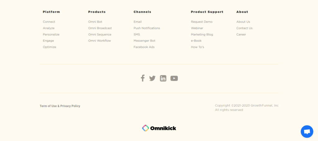
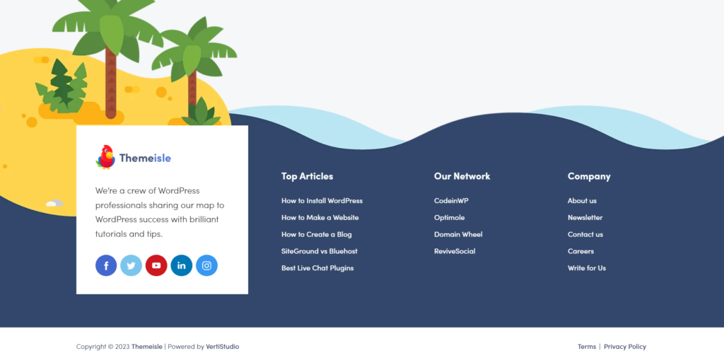
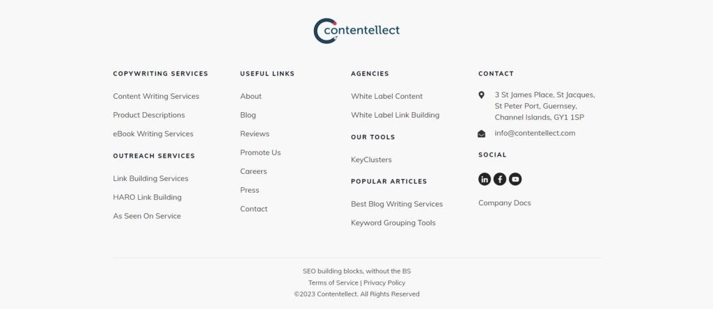
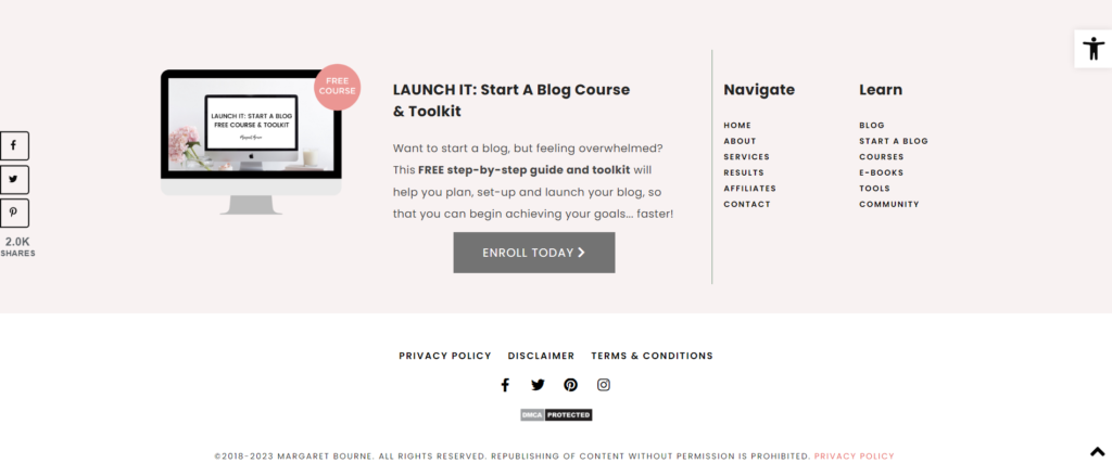
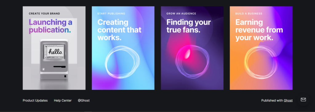
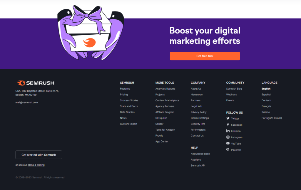
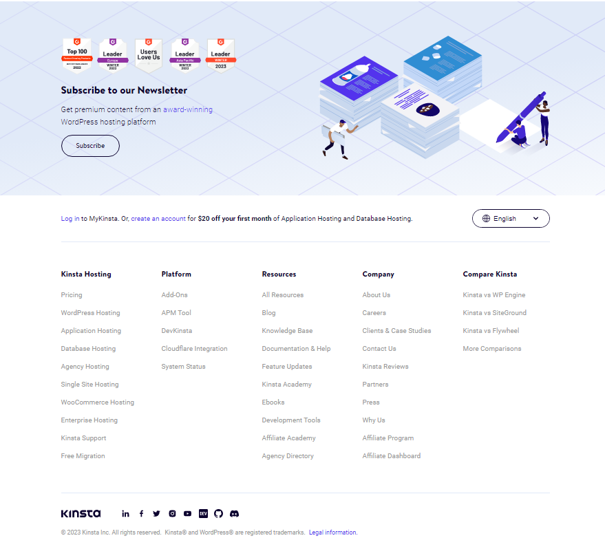
57 Blog Footer Examples [For Blogs]
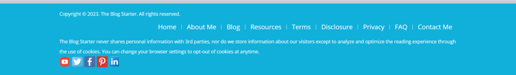
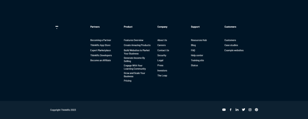
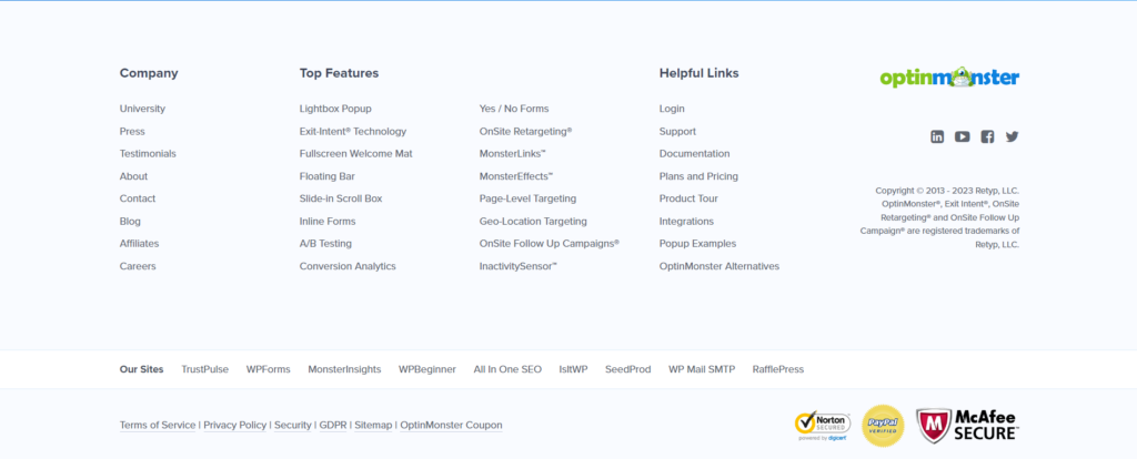
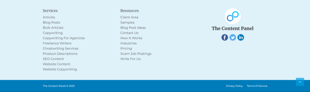
Here are 57 examples of footers that belong to blogs. Specifically, blogs. Footers vary from site to site, and you can try countless designs and make something unique. But, it’s better to stick with what works. Especially for blogs. These blog footer examples work best for blogs and suit them well.


15 Mobile Footer Examples
Here are 15 examples of mobile footers that can be used for inspiration:


FAQ
A website blog footer is the bottom crust of every page of a website. As the name suggests, the footer stands for the foot.
And the footer is essentially the feet of a website.
The main benefit of having a blog footer is to have all your important links in one place, in a well organized manner for users to access.
It also provides SEO benefits, as these links are internal links [Though they don’t hold as much weight when they’re part of the footer].
It’s also the perfect place to include any information you would want the user to have easy access to, that would otherwise be awkward to place elsewhere on a web page.
The blog footer should include, at the bare minimum, your business name, logo, copyright notice, links to legal pages, contact information, and the header navigational links.
The blog footer doesn’t need to be of a specific size. It can be large or small. What matters is whether it contains all the necessary links and information needed [Mentioned in the article]
Yes a blog should have a footer to display important links, social media links, and legal pages
You should write a mission statement along with your logo and have links to important pages.