19 Blog Sidebar Examples [From Highly Successful Blogs]
The blog sidebar is an important element that can increase user session times on your blog. It’s the perfect place to display calls to action to improve your click through rate.
We will also discuss questions like whether major blogs have sidebars & how the mobile first world is affecting sidebars.
How to create a WordPress sidebar
This article will cover how to add a sidebar on WordPress [Step by step]; 7 widgets you can add to your sidebar; Whether a sidebar is still worth it in 2023; And 19 sidebar examples to give you inspiration. Keep reading.
How to add a sidebar on WordPress
Here is a step by step procedure to add a sidebar to your WordPress blog [This was done in the Kadence theme. The process should be similar on most themes with minor differences]
- Go to the WordPress dashboard > Customize
On your WordPress dashboard, in the left sidebar, hover over Appearance and then click on Customize:

If you haven’t set up WordPress, see our step by step guide on how to set up a blog from scratch. - Click on Posts/ Pages Layout
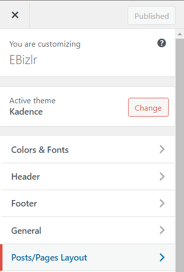
Click on the Posts/ Pages Layout in the left sidebar.

- Click on Page Layout
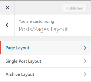
If you want to display a sidebar on all your pages, click on the Page Layout.

- Choose the sidebar display option
Here, you can choose either to have a left or right sidebar. This step can be repeated for the post pages by repeating step 3, but instead, click on Single Post Layout.

Now, we move on to customizing the sidebar - Click on General
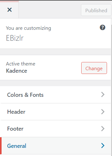
Click on the General tab.

- Click on Sidebar
Click on the sidebar tab.

- Customize the sidebar
Here, you can customize the sidebar width; The spacing between elements [widgets] in the sidebar; Enable sticky sidebar & enable only the last widget in the sidebar to be sticky.

- Customize the sidebar design
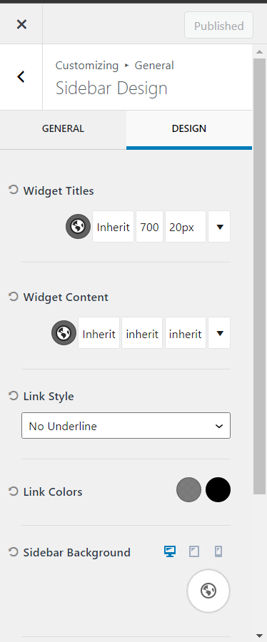
Click on the design tab. Here, you can customize all the design features of your sidebar including the Widget title & widget font, colour, and size; Link style & colours; The sidebar background colour; Sidebar divider border size and colour; And the internal sidebar padding.

In the Kadence theme, you have the option of not only changing the background colour but you can also having an image or colour gradient as a background.
If your customization settings look different, search Google for sidebar customization for your specific theme. Though, we suggest using Kadence [A FREE, Fast and Lightweight theme] that provides more than enough customization features to build a custom theme.
Go to step 7 in the procedure above, and enable sticky sidebar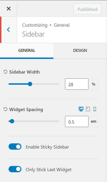
You can even enable Only Stick Last Widget if you only want the last widget of the sidebar to be sticky.
Go to step 4 in the procedure above, and select a layout that doesn’t have the sidebar. This will automatically remove the sidebar. So you can choose either Normal, Narrow, or Fullwidth [And the sidebar will be removed].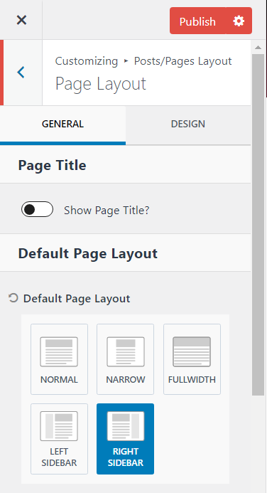
To edit a blog sidebar on WordPress, go to WordPress dashboard > Hover over appearance in the left sidebar, and then click on customize. Then click on General > Sidebar > And then you can eid the sidebar accordingly [Follow steps 5 to 8 in the procedure above]. To edit the widgets displayed in the sidebar, go to the WP dashboard > Appearance > Widgets. And customize the widgets accordingly.
You have officially added a sidebar to your blog. If you haven’t already, check out our blog header design guide to add a great header and to see 79+ header examples.
And, don’t forget to go through our blog footer design guide to learn how a great footer is supposed to be built [With 72 footer examples provided].
7 Blog sidebar widgets
I’m sure you’ve seen articles telling you to put several elements into your sidebar that include:
- Navigational links to key pages
- Ads for products or services
- Email signup forms
- Popular or related posts
- And social media links.
But, based on our case study [More on this later], we realized only a few elements are necessary to convert users well and not affect user experience.
Moreover, these elements can easily be placed into your blog post content.
So, your mobile visitors will still have access to your sidebar content within the blog post itself. But, we will still provide you with all the blog sidebar widgets you can place in your sidebar.
Here are 7 blog sidebar widgets:
A Call to action
CTA banners, or Call To Action banners, are high quality graphics that make users convert. Below are two great examples of CTA banners used in the sidebar:
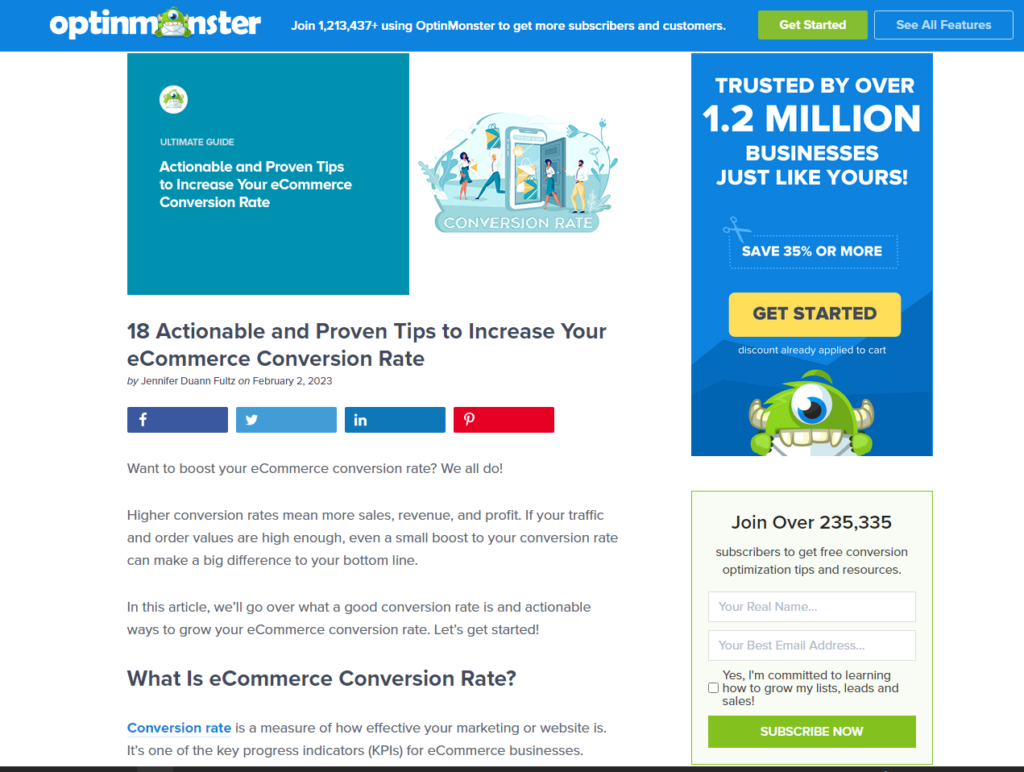
The call to action can be used to:
- Get users on your email list [Read our guide on how to build an Email list]. Here is an example of an Email CTA banner used by OptinMonster

- Redirect users to certain guides or pages you want them to see specifically.
- Or landing pages where you provide your own product or service: Emphasis on your “OWN”, or that’s just affiliate marketing or advertising. [Affiliate marketing & Advertising are just TWO of the 9 methods to make money blogging]. Below is an example of a CTA banner that will take you to a service landing page:

You can have a single banner or a couple of them. They can either be placed through the length of your sidebar or stuck to the screen.
The sidebar is one of the best places to have CTA banners, as it is on the side of the content, for them to simply engage with.
When a user is getting help from your blog post, and then see a CTA banner, they are more likely to convert because you are currently helping them.
Best WordPress sidebar widget
The best WordPress sidebar widget to make CTA banners from is HollerBox.
Hollerbox is a lead generation tool & can be used to build all sorts of popups.
And it has a solid advantage over other lead generation plugins like Popup Maker, OptinMonster, WPForms, etc.
Which is that its pricing doesn’t increase based on the success rate of your led generation like the tools mentioned above.
This is why it is ONE of the 12 Must Have plugins.
Related blog posts
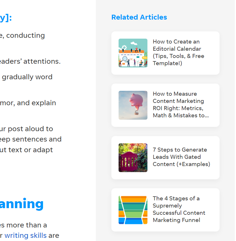
Related posts are great to have in the sidebar since they provide users with content that’s relevant to what they’re currently consuming.
It’s almost certain they’ll click on relevant content if your blog post titles are strong [That are displayed to represent the related posts]. Learn how to write jaw dropping blog post titles to skyrocket your click through rate.
Here is a sidebar example that displays related blog posts:
Recent blog posts
You can also add recent blog posts to the sidebar. It’s a simple way to get existing traffic to your newest blog posts with little work.
And, getting traffic quicker to your new blog posts is healthy for blog post SEO.
Learn about 9 other methods to increase your blog post traffic.
Popular blog posts
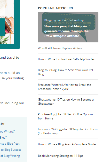
Popular blog posts are great for displaying your best performing posts.
The primary reason to do so is to keep users on your blog for longer periods of time [Which is another positive sign in Google’s eyes].
Here is a sidebar example displaying popular blog posts:
Helpful resources
The sidebar is perfect to showcase resources you provide which can include:
- Freebies
- Downloads
- Courses
- Guides
- Tools
Here is a sidebar example of a free tool that WordStream provides:
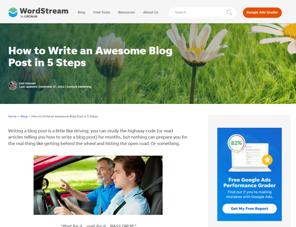
Here’s a closeup

Ads
Ads are something you should actually avoid placing in your sidebar, with a single exception.
Simply, because ads are disruptive content, and quite distractive. Plus, they won’t make you much money per user.
So, it’s not worth ruining user experience for little returns on investment.
But, the exception we refer to is, if your blog’s only monetization method was running ads.
Meaning that if you had only planned to monetize your blog with just ads, then, yes use ads in your sidebar.
But, if you are monetizing your blog through affiliate marketing, sponsors, or your own products/ services, ads aren’t worth it.
Check almost any blog out there that runs ads and affiliate marketing. Affiliate marketing provides almost 3 – 4 times the revenue ads can.
Plus, they’re not disruptive in the slightest. So, use ads if it’s your only monetization method.
1. Go to your WordPress dashboard > Select Widgets > Click on the Add element +
And then, search for code, and you will have the choice of adding in code, shortcode, or HTML.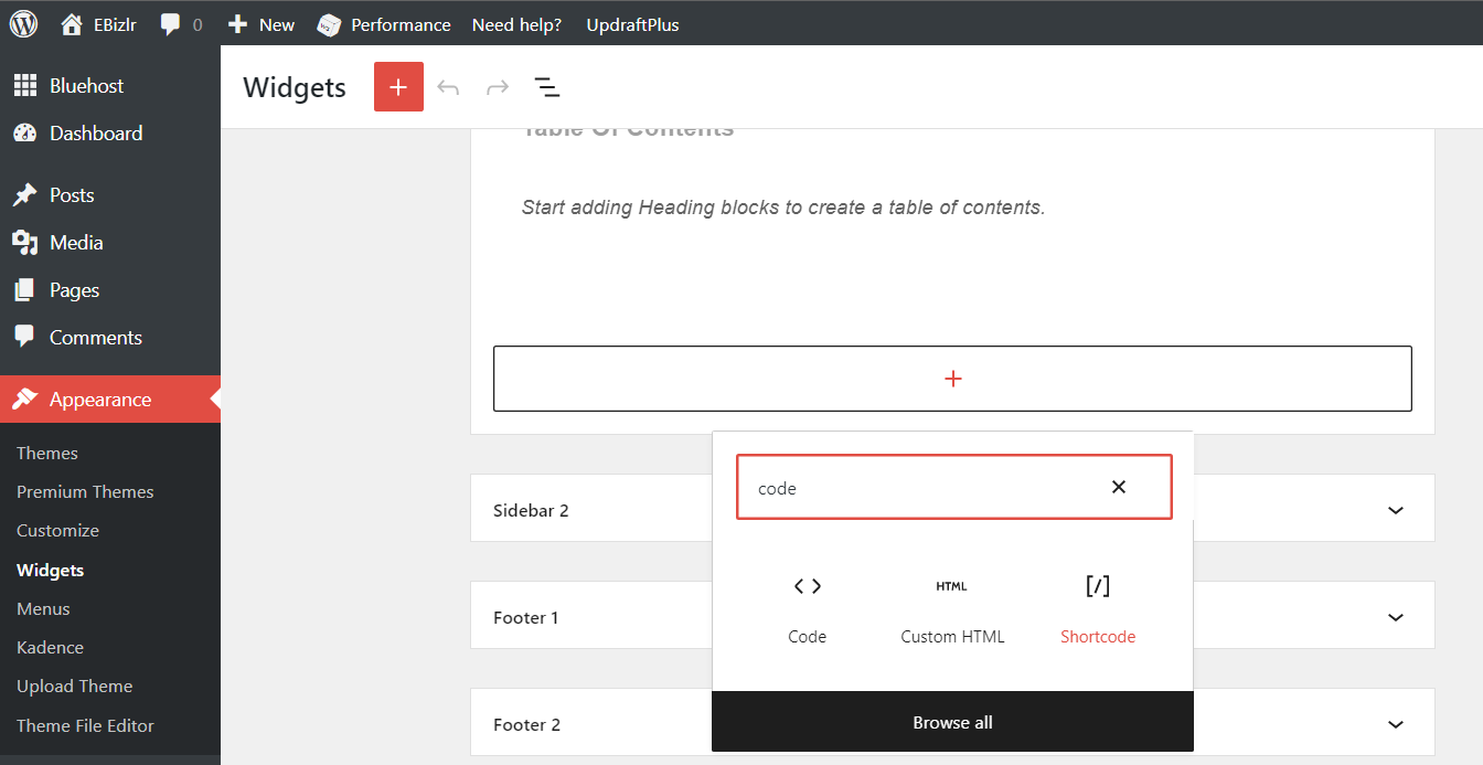
Then, simply go to your Ad platforms [Like Google AdSense, Mediavine, etc] and get the shortcode [Or code or HTML], and simply insert it.
Your Bio should be in the blog sidebar
A bio is an element you won’t find in sidebars for major blogs. Mostly because bios are used to introduce yourself.
But, major blogs have already reached a point where their introduction just doesn’t need to be in the sidebar.
Having an about page is more than enough for them.
But for new blogs, it’s almost a needed element so any new visitors can immediately know who’s on the other side of the screen.
As well, a bio helps towards E-E- A-T, which is an essential SEO ranking factor. So include a biography if you’re a new blog. Find out what E-E-A-T is & How you can use E-E-A-T SEO to rank higher in the SERPs.
Here is a sidebar example that displays an author biography:

The author biography will generally comprise a picture displaying the author(s) along with a short blurb introducing them to visitors.
Social sharing links
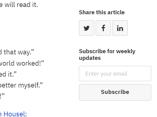
Social links make it easy for readers to share the content they’re reading. And it’s much easier to share the content of the social sharing icons right beside the content, in the sidebar. Here are two sidebar examples displaying social links:

Search bar
The search bar is an uncommon widget to add to the sidebar. And that’s typical because users barely use it. But, it is used by blogs that have loads of instructional educational content that is searchable.
Searchable means that the content is something that a person will search for (Mostly SEO content). Whereas disruptive content is usually thrown in front of users’ eyes and then they engage with it (Like social media content).
So, if you have loads of searchable content, then having a search bar may be a good idea. Here is a sidebar example that displays a search bar:
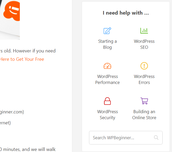
Table of contents
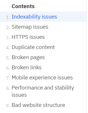
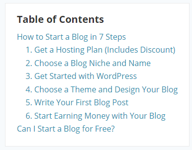
The table of contents displays the main sections of the blog post a user is current;y on.
And they can click on this widget [In the different section headers] to automatically be scrolled to that section of the post. It makes navigation easier.
Here are a two sidebar examples that display the table of contents
Are blog sidebars still worth it in 2023?
Yes, sidebars are still worth using. Even in 2023.
Even though they are hard to display on mobile, there is still a good chunk of your traffic visiting your site through the desktop.
And, you should use your sidebar for them. And for your mobile users, try placing your sidebar information within your blog content.
You won’t be able to place all your sidebar information into the blog post content, but elements like CTA banners and related posts can definitely go into the content itself.
Do major blogs have sidebars? [Case study]
We checked out the most successful blogs in existence to see whether they have a sidebar.
And if they do have a sidebar, we had a look at what they place in their sidebar. And, we provide this data to you.
| Blog Name | Sidebar used? |
|---|---|
| Forbes | Yes |
| Smashing Magazine | Yes |
| Gizmodo | Yes |
| Perez Hilton | Yes |
| Copyblogger | Yes |
| Techcrunch | Yes |
| Mashable | Yes |
| Engadget | No |
| HuffPost | Yes |
Therefore, aside from Engadget, every single blog has a sidebar.
Now, this data is definitely biased as most of these blogs are media blogs, and run an insane amount of advertising.
If you haven’t guessed already, these ads are displayed in their sidebar.
But, besides the sidebar, we found something pretty common.
We only found sidebar sections for related posts, and Call to action banners.
So, you won’t go wrong with having a sidebar on your blog. But, there’s another concern. Mobile.
Sidebar losing to Google’s Mobile first updates
With over 60% of online sessions now occurring through mobile devices, Google has been pushing websites to make their websites and blogs mobile friendly.
Having a minimized screen to display your blog isn’t a problem for the most part. But, the sidebar just doesn’t have space on the side.
And, so sidebars just get knocked out of mobile devices. Of course, there have been solutions to display them through menu pop ups, etc.
But, it still has done quite the damage to a sidebar’s reputation.
But, why are major blogs [like the above] not doing something about their sidebar with the mobile first updates?
It’s simple, as mentioned before, most of their sidebars are just to display ads. So, if they don’t have a sidebar to show ads, no problem.
All they do is just shove those ads in between the content or have them pop up on the screen.
Does a sidebar distract users from the blog post?
Yes, a sidebar will most certainly distract users from the main content. But, in our era, distraction is craved by everyone.
No one sees distraction as a nuisance.
But, nonetheless, it will reduce the amount of information they’ll be able to retain and take away if they get distracted continuously.
This is not good for blogs that provide information requiring a user to remember well. Which depends on your niche.
If you’re in an informative niche that requires strong attention to learn, you could still have a sidebar, but make sure it’s NOT eye catching.
Whereas if your niche is more entertainment based, have quite the flashy sidebar.
[Learn more about what niche you should consider for your blog]
And this can be done well only through testing with and without a sidebar and understanding the difference in your user experience, user session rates, and conversion rates.
19 Sidebar Examples
Here are 19 sidebar examples you can take inspiration from to build your own sidebar:
1. WPBeginner



2. Wix

3. WordStream


4. SmartBlogger


5. MasterClass

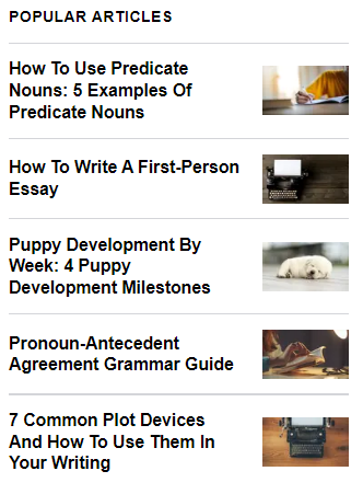
6. Ahrefs

7. NeilPatel


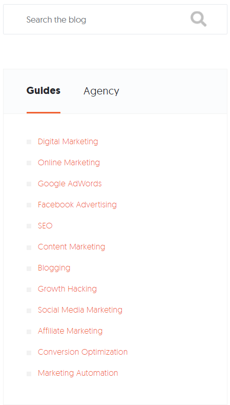
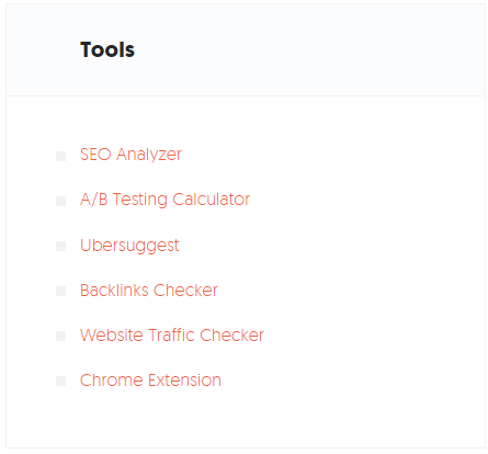

8. Chron
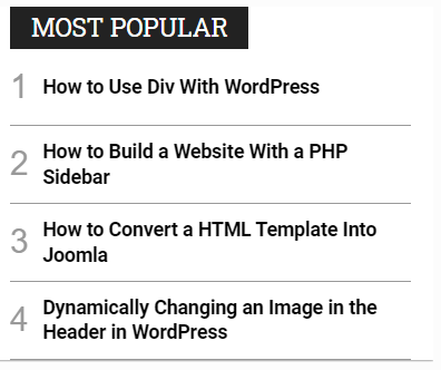
9. FirstSiteGuide

10. Suttida


11. SEMrush
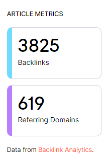
12. PPCExpo

13. MOZ

14. TwoWheelsMarketing

15. CyberCityExpress


16. Bramework
17. Copy.ai

18. NichePursuits

19. SearchEngineJournal




FAQ
No. Sidebars are NOT outdated. They aren’t a trend. Rather, they’re an important element of a blog. They can greatly improve lead generation and user session duration if used correctly.
You should place 3 widgets on your sidebar: A call to action to your product/ service; Related posts; And an email list call to action
The purpose of a sidebar is to provide users with navigation and it’s a place to display CTAs to increase lead generation. They are important in increasing user session times because they can be used to display relevant links that users can click on [Which keeps them on your blog].
You can display different sidebars on different content using the easy custom sidebar plugin. Read this guide to see how to use this plugin to display different sidebars
The sidebar width should be between 20% to 40% of the total page width.


